
Vodafone operates across more than 20 markets. At that scale, design inconsistency isn't just an aesthetic problem — it's an operational one. Source, the company's global design system, existed on paper but wasn't functioning as a system in practice. Components diverged across markets. Documentation was sparse or absent. Engineers and designers were working from different truths.

I was brought into Vodafone's Source design system team as the system was approaching an inflection point. It served 20+ markets, but "served" is generous — components had diverged, documentation was sparse or absent, and engineers and designers were working from different sources of truth. The InVision contract was ending in months. The system had the ambition of global infrastructure but the reality of a neglected library.
My mandate wasn't to redesign components. It was to figure out why the system had failed to function and build the structural, governance, and tooling foundations that would make it sustainable.


Diagnosis Before Direction
Before touching anything, I needed to understand why the system had failed to scale — not just what was broken, but the structural reasons it stayed broken.
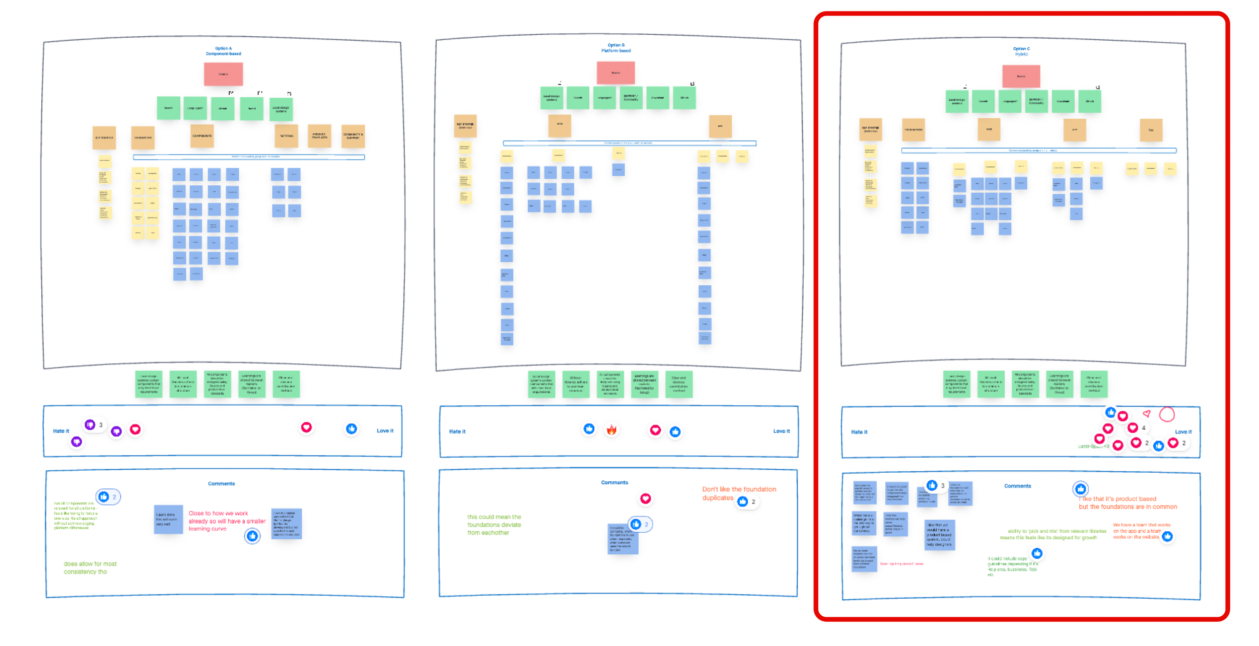
I ran a full audit of the existing library alongside interviews with designers, developers, and product leads across multiple markets. The research was synthesised using affinity mapping — colour-coded insights from individual stakeholders were clustered into emerging themes, then refined into a consolidated set of interview themes that revealed systemic patterns rather than isolated complaints. What surfaced wasn't a single failure point — it was a compounding set of them: components named inconsistently between design and engineering, an information architecture that had grown organically without governance, redundant variants that had proliferated as teams built workarounds rather than contributing back, and no clear ownership model to prevent the same drift from recurring.
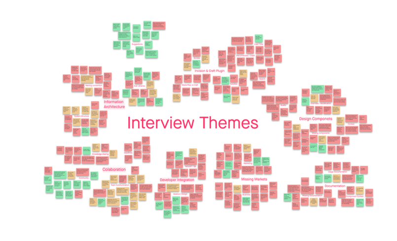
The root issue was that Source had been built as a library, not a product. That diagnosis became my thesis for the entire engagement: every decision I made — from IA restructuring to the governance model to the Figma migration — was downstream of treating Source as a product with users, a roadmap, and accountable ownership.
Re-Architecting the Foundation
With a clear picture of the failure modes, I approached the rebuild in phases rather than all at once — partly to manage risk across live teams, partly to create feedback loops as we went.
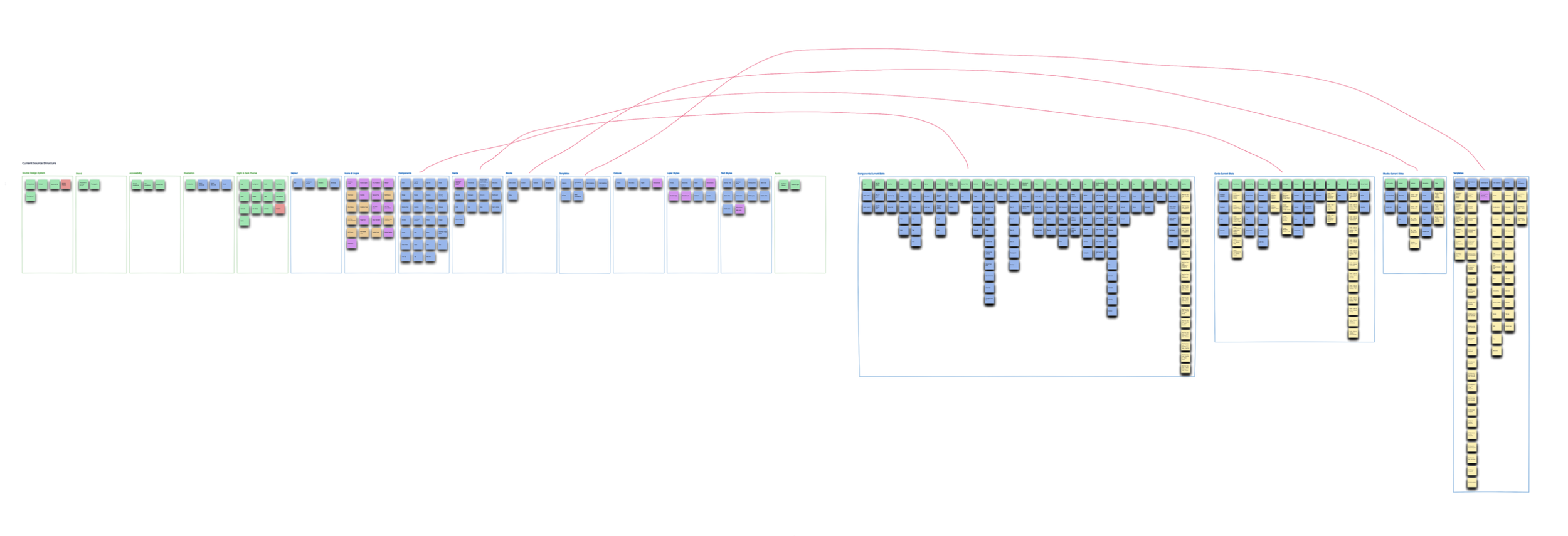
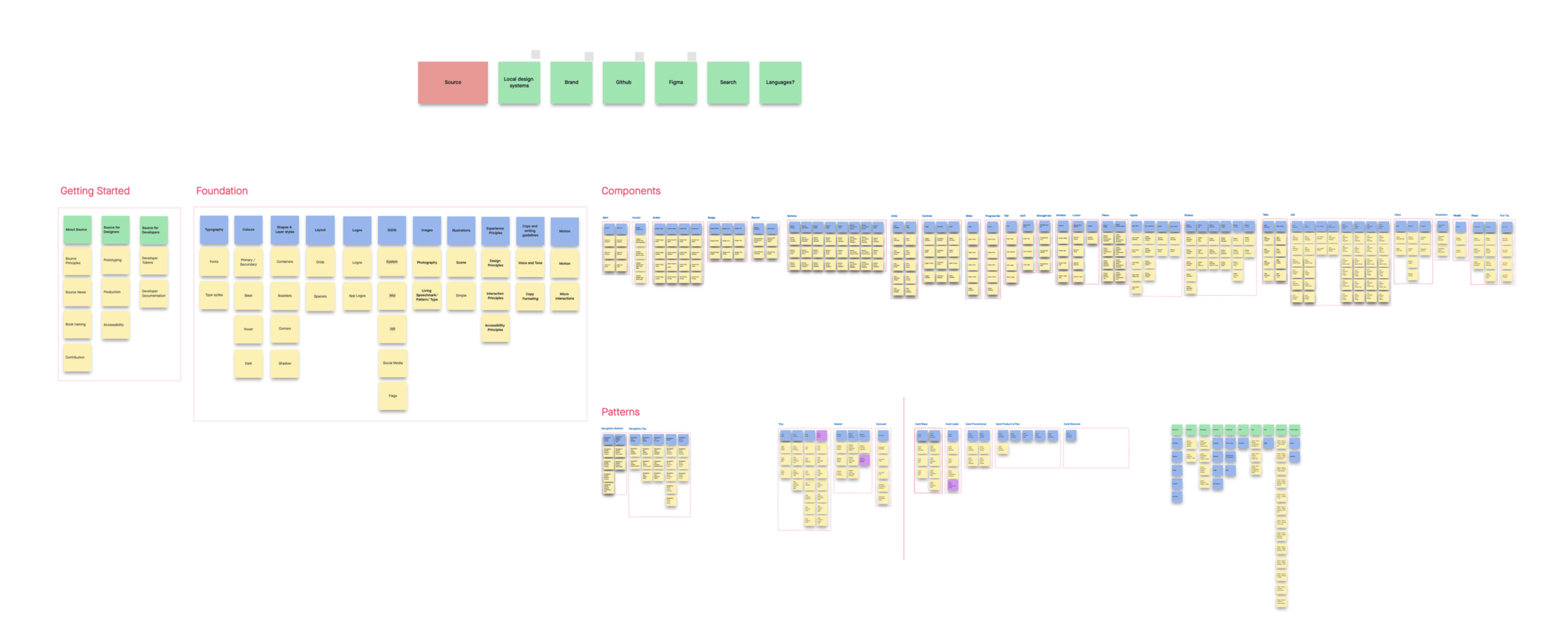
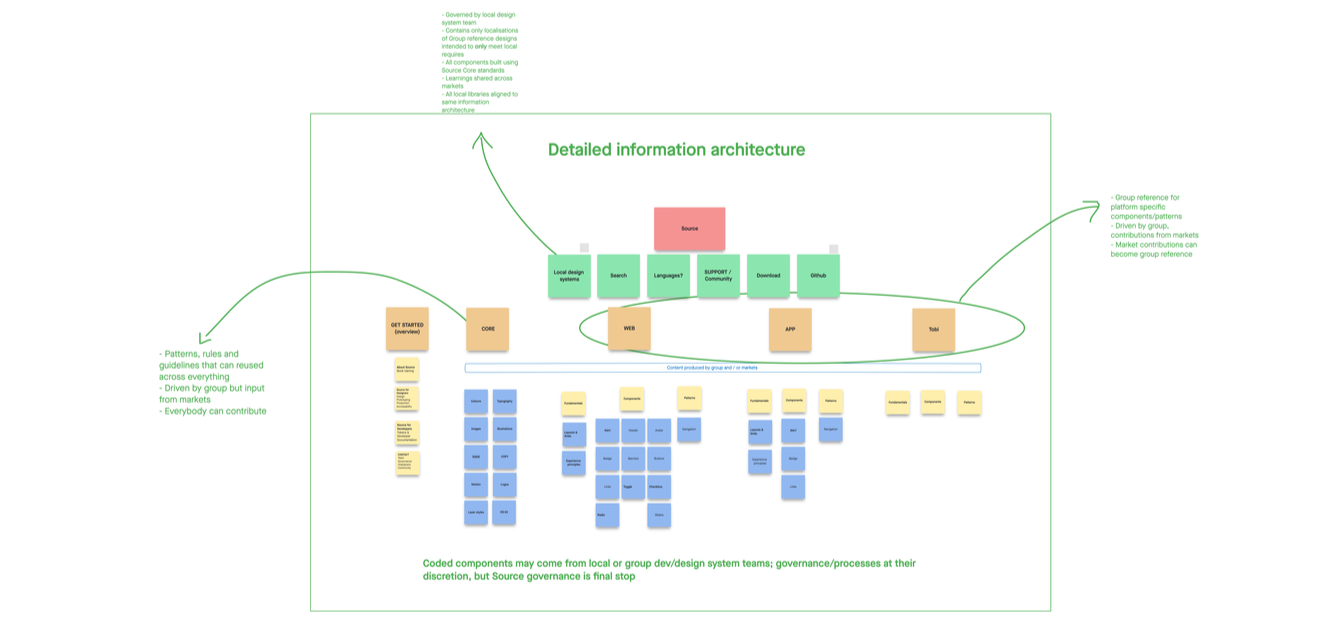
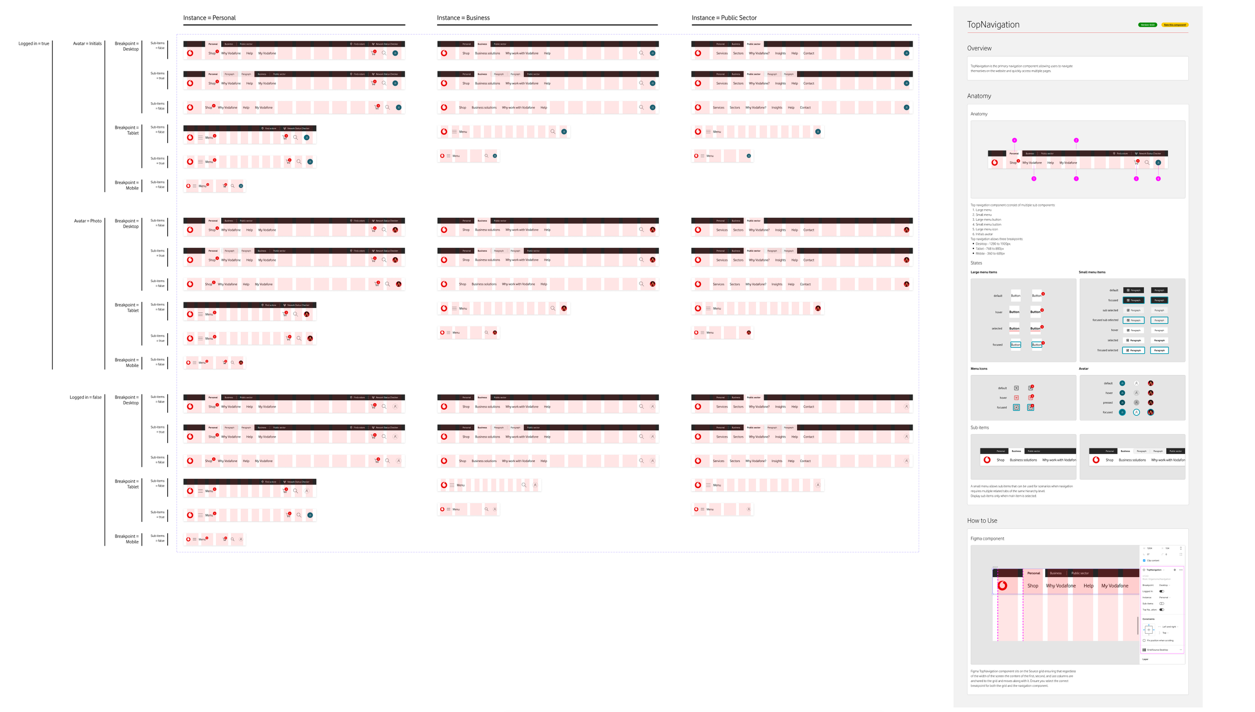
Information Architecture First. The existing structure reflected how the system had been built, not how designers actually navigated it. I redesigned the information architecture around four clear top-level sections — Getting Started, Foundation, Components, and Patterns — with system-level navigation providing access to local design system guidelines, component status tracking, style references, and search. The old structure had components and foundations tangled together without a clear hierarchy; the new IA gave designers a predictable mental model and reduced the cognitive overhead of finding the right element.
Consolidation Over Addition. A significant portion of the audit identified redundant components — variants that existed because teams had made local modifications rather than proposing shared solutions. I made deliberate decisions about what to remove, what to merge, and what to elevate into the core library. This required negotiating with market teams who had built dependencies on non-standard components, which meant framing consolidation as reducing their maintenance burden rather than taking something away.
One of the most impactful changes was establishing a shared naming convention across design and engineering. This sounds procedural, but it materially changed handoff quality — when a developer could map a Figma component directly to a production code equivalent without translation, friction dropped immediately.
Colour System, Responsiveness, and Accessibility. The colour system required particular care in a multi-product organisation. I restructured the colour architecture across Vodafone RED and primary colours, secondary palettes, state colours, and a monochrome palette — with explicit usage guidance for backgrounds and panels, enabled and disabled component states, interaction states, focus states, text colours, and alerts and notifications. Critically, this work was scoped specifically to Vodafone Digital products while keeping the original brand colour palette intact, requiring clear documentation of where the digital palette applied and where it didn't. Icons were standardised with default and inverse variants supporting both light and dark contexts.
Components that lacked responsive behaviour or didn't meet accessibility standards were either rebuilt or flagged for deprecation. This forced some difficult conversations about timelines, but establishing non-negotiable standards was the only way to prevent the same gaps from re-emerging.
Documentation as Product Design
Most design systems underinvest in documentation because it's invisible to the end user. I treated it as a first-class design problem.
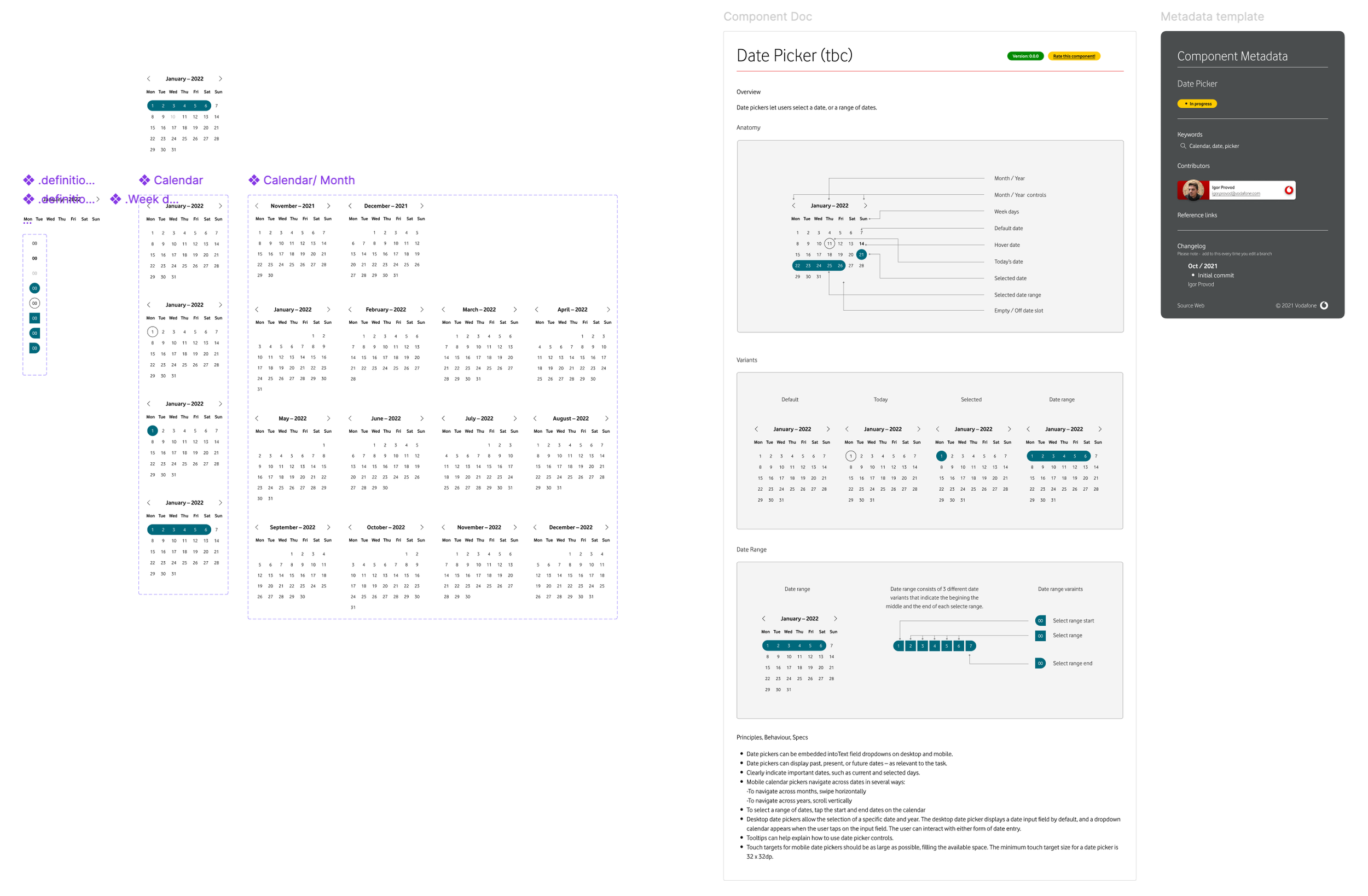
For each component, I wrote documentation that answered three questions: what it is, when to use it, and when not to. The last question was often more valuable than the first two — designers frequently reached for the wrong component not because they didn't understand it, but because they didn't know what it was designed to solve versus what it wasn't.
At the system level, documentation was published on Zeroheight, which became the single source of truth for principles, usage standards, and component specs. This gave teams a persistent, searchable reference that lived outside the design tool itself. Supporting materials included a TMC playbook and a dedicated Vodafone Digital products playbook, which provided market-specific guidance while maintaining alignment with the global system. The goal was to reduce the number of questions that needed to come back to the core team while increasing the quality of local decisions.
Designer–Developer Integration
The gap between design and engineering was one of the most persistent sources of friction I found in the audit. Designs were being handed off with assumptions that weren't shared, components were being rebuilt in code that already existed, and there was no clear process for raising discrepancies between the library and the codebase.
I partnered closely with engineering leads to create parity between Figma components and production code. This meant sitting in on development reviews, understanding where the code diverged from design intent, and being willing to adjust the design library when engineering constraints were legitimate rather than insisting on design primacy. Design tokens became a key part of the governance conversations — ensuring that colour, spacing, and typography values were defined once and consumed consistently across design and code. The handoff process itself was redesigned — clearer annotation standards, defined spec templates, and an agreed escalation path when something in the library didn't map cleanly to code.
Governance and Contribution
A design system without a governance model is a snapshot, not a system. Everything I'd rebuilt would degrade again without a structure for how teams contributed, how decisions were made, and who was accountable for what.
I designed a dual governance structure distinguishing between local governance and global governance. Local governance gave individual markets the autonomy to extend the system for regional needs within defined guardrails. Global governance — operated through a formal governance committee with representation from key markets and cross-functional stakeholders — owned the core library, defined contribution criteria, and maintained the review process. The committee ran on a regular monthly cadence, with documented agendas and decisions covering topics from new component proposals to colour system updates to migration progress.
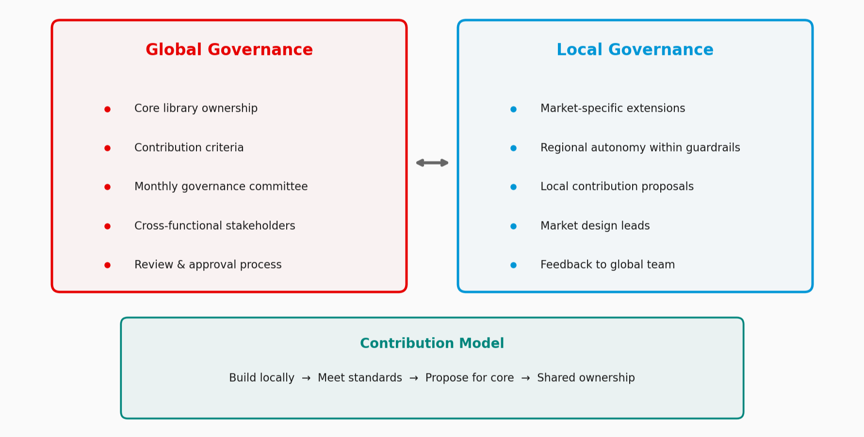
The contribution model was designed to turn market teams from consumers into co-owners. When a team built something locally that met system standards, there was now a clear path to propose it for the core library. This shifted the incentive structure: instead of building workarounds privately, teams had a reason to build to a shared standard.
Platform Migration
Running a global design system on Sketch and InVision had become a structural limitation. The InVision contract was ending in April 2021, and the platform's constraints — asynchronous collaboration, manual version control, no real-time contribution across markets — made the governance model I was building essentially unviable on the existing tooling.

I used an innovation sprint methodology to plan and scope the Figma migration, developing a structured programme deck that defined goals, strategy, and tactics. The migration itself was phased: establishing the Figma library architecture first, then migrating and rebuilding components to take advantage of Figma's native capabilities — shared libraries, real-time collaboration, and built-in version control — rather than simply replicating the old Sketch structure in a new tool.
The migration required change management as much as technical execution: training, documentation, and sustained advocacy to get teams to shift workflows they'd built over years.
Adoption and Advocacy
A design system is only as effective as its adoption. I treated internal advocacy as part of the role — not a secondary concern.
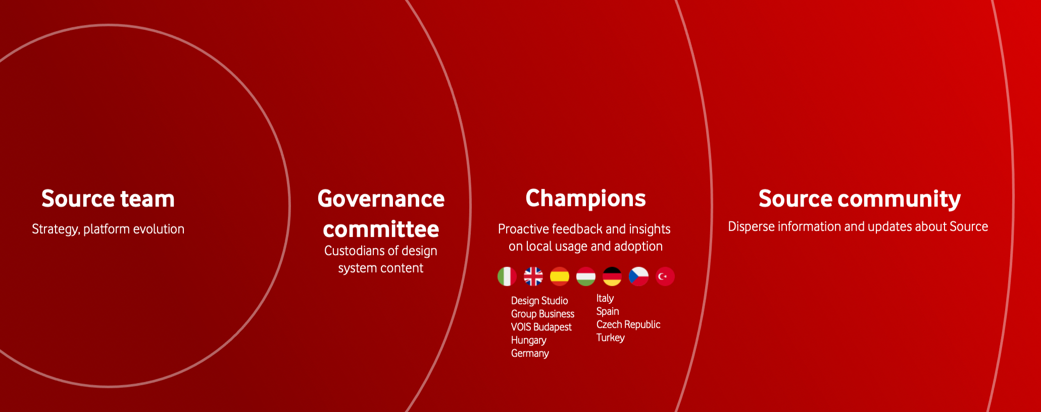
A central mechanism for this was the Source Champions programme — a network of design leads across regions who acted as local advocates, onboarding support, and feedback channels for the core team. Champions met monthly in dedicated sessions where I shared system updates (new Figma components, colour system changes, documentation additions), gathered feedback on adoption friction, and aligned on priorities. These sessions covered everything from specific component releases like Form Field Wrapper updates to broader initiatives like the colour palette restructuring.
Beyond the Champions programme, I was present in product planning conversations to advocate for system use, ran workshops and onboarding sessions for teams in new markets, and worked to understand specific friction where teams were resistant rather than defaulting to top-down mandates — often the resistance pointed to a real gap in the system that was worth addressing.
Outcomes
From a 2021 user survey across global markets:
53% reduction in time to design screens and journeys
62% faster designer–developer handoff
58% faster onboarding for new team members
78% of users found the system easy to use
66% reported meaningful time savings
28,000+ components deployed across teams
The metrics validated the rebuild, but the outcome I'm most confident in is structural: Source moved from a component library that was one reorg away from irrelevance to a governed design system with dual local/global ownership, a Champions advocacy network, and a contribution model that incentivized market teams to build to shared standards rather than work around them. That's the difference between a library and a system.