Employee Attendance Visibility
Redesigning how employees understand their own attendance standing — giving them real visibility into their incident score, policy milestones, and full attendance history inside an enterprise scheduling platform.
The Challenge
The attendance policy is one of the most stressful things about hourly work. You get dinged for being late. You accrue points. At some threshold, your manager steps in. And in most systems, employees don't really know where they stand until someone tells them — which is usually not good news.
Dayforce had attendance tracking built in. Employees could technically access their attendance records, but the experience was fragmented: separate screens for incidents, violations, and year views, with no clear at-a-glance summary of where things stood. Most employees either didn't know the feature existed or found it too buried to be useful.
My work was to redesign the attendance experience as part of a broader T&S (Time & Scheduling) Overview — giving employees a clear, accessible window into their own standing without having to dig for it.
Discovery
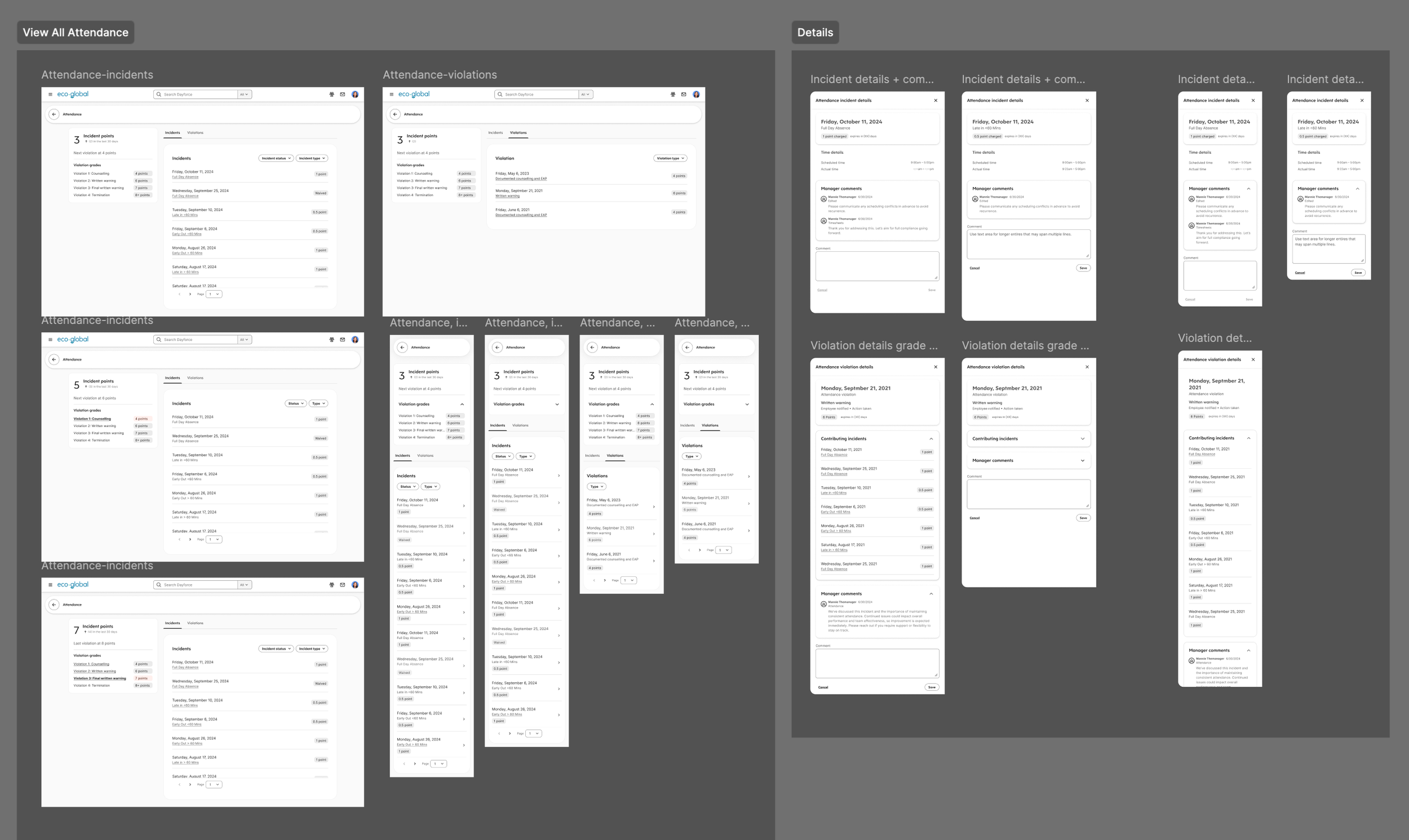
Before designing anything, I documented what already existed in the system. The FigJam audit captured the current state, screen by screen:
Calendar — the entry point for the T&S Overview, already in the product.
Attendance — the existing attendance score view, showing a points progress bar but lacking context for what the numbers meant or what happened next.
Attendance – Incidents — a list of individual incident records, but with no summary at the top and no link back to the score or violation thresholds.
Attendance – Violations — a separate screen for when points crossed a policy threshold, disconnected from the incidents list.
Attendance – Year View — a full calendar showing absences, late arrivals, and early departures for the year, useful in principle but hard to find.
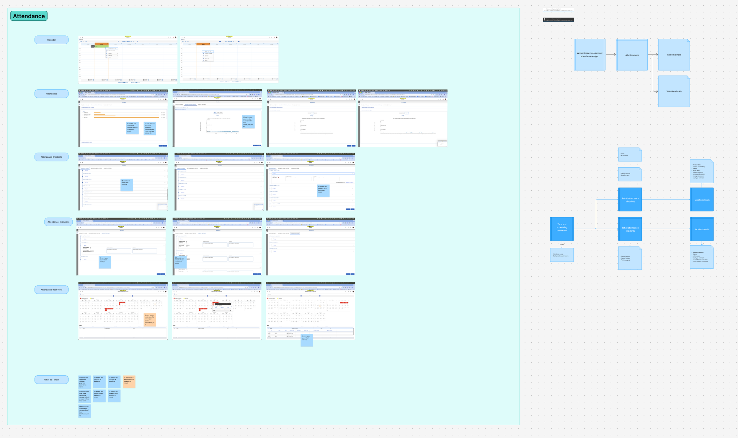
From the audit, I pulled together what employees actually needed to know:
Their current attendance score at a glance
A record of all incidents, with details on each
A record of all violations, with details on each
Long-term view of all incidents (absent, late, early)
Visibility into when their manager will take formal action (write-up, letter on file)
Their score trend over time — month, year, career
The gap wasn't that the data didn't exist. It was that the design didn't make it legible.
Design
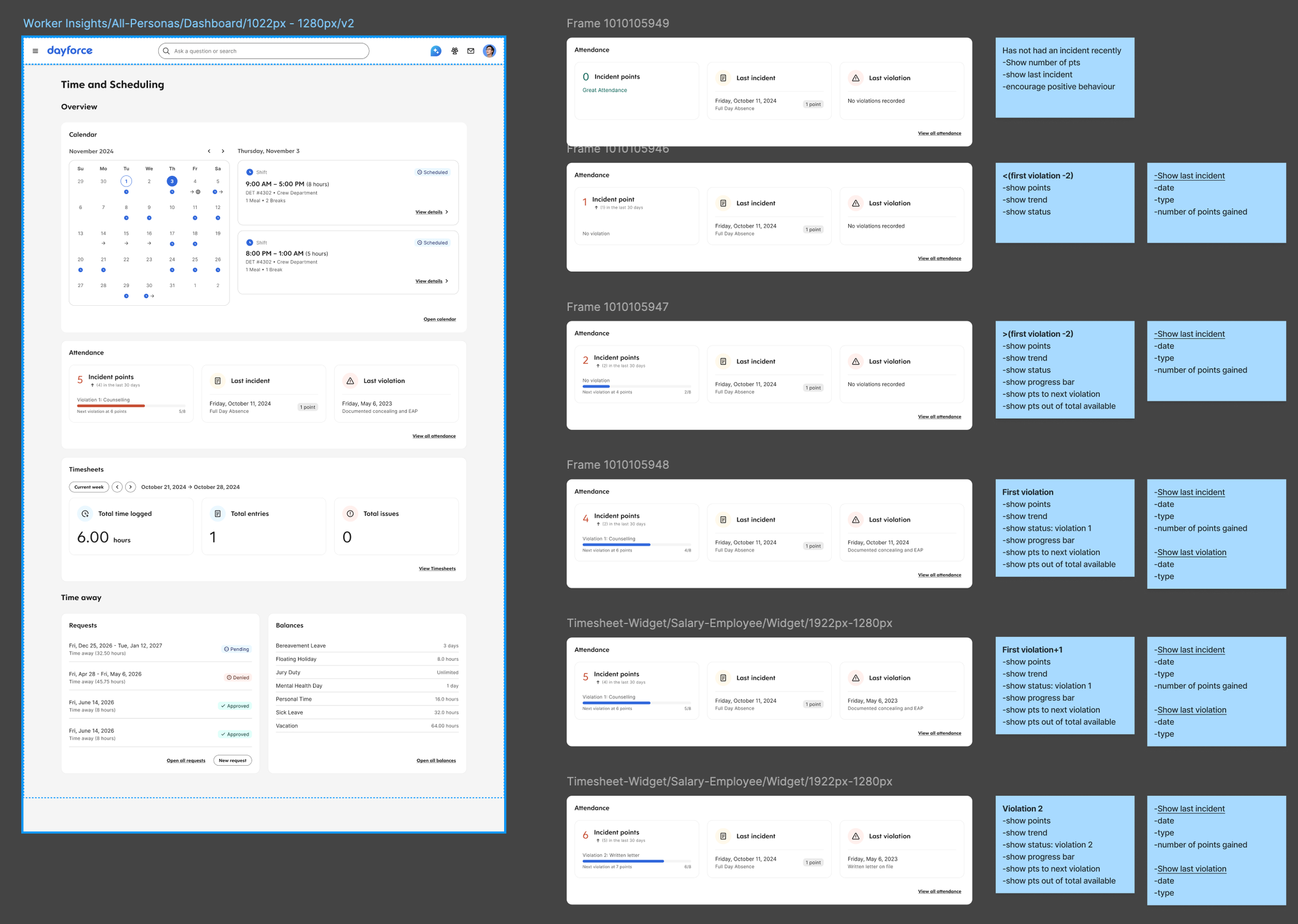
The redesign brought attendance into the time and scheduling dashboard as a dedicated section — one that gives employees the information they need without requiring them to navigate to three different places.
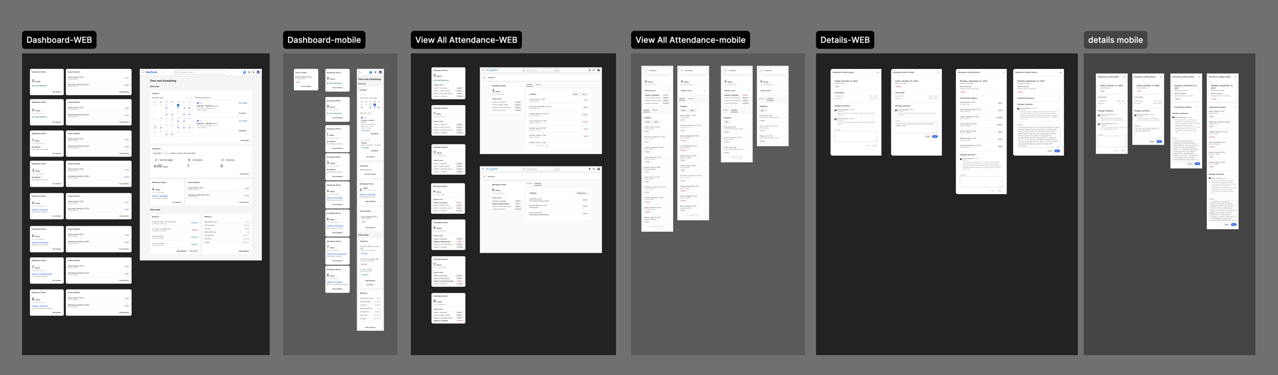
The Attendance widget on the Overview surfaces the essentials at a glance:
The left card shows Incident Points — the employee's current score, their recent trend (points accrued in the last 30 days), the name of the active violation threshold they're at, and a clear line of text stating when the next escalation triggers. This was the piece completely missing from the previous experience: employees can now see exactly where they stand relative to the organisation's attendance policy, without having to ask a manager or dig through a separate screen.
The right card shows Latest Incidents — the two or three most recent entries with the date, incident type, and point value assigned. It gives a quick read on recent activity without overwhelming the user.
A "View all attendance" link at the bottom connects to the full attendance history page.
The full attendance page (accessible from the widget) provides the complete picture in one place:
Full incident history with dates, types, and point values
Violation records with policy thresholds clearly labelled
Year view showing the pattern of absences, late arrivals, and early departures across a calendar
Key Design Decisions
Surface the threshold, not just the score. Showing an employee "4 points" is meaningless without context. The design makes the next milestone visible: what the violation is called, what it means, and how far away it is. That single detail turns an opaque number into something actionable.
Put it on the Overview, not buried in a sub-page. The existing attendance screens were accessible but not prominent. Employees who needed to know their standing had to navigate deliberately. Surfacing the summary on the T&S Overview means employees see it as part of their regular check-in — not only when something has already gone wrong.
Connect incidents, violations, and scores into one story. The audit showed these were three separate screens with no obvious relationship between them. The redesign treats them as one narrative: the widget is the headline, the detail page is the full article.
Transparent, not alarming. The design is clear without being anxiety-inducing. Employees see their score in context — with a trend, a policy name, and a defined next step — rather than just a number. The intent is for employees to feel informed, not watched.
What Shipped
The following were delivered to developer-handoff quality:
Attendance widget on the T&S Overview — Incident Points card + Latest Incidents card
"View all attendance" detail page: full incident list, violation records, year view
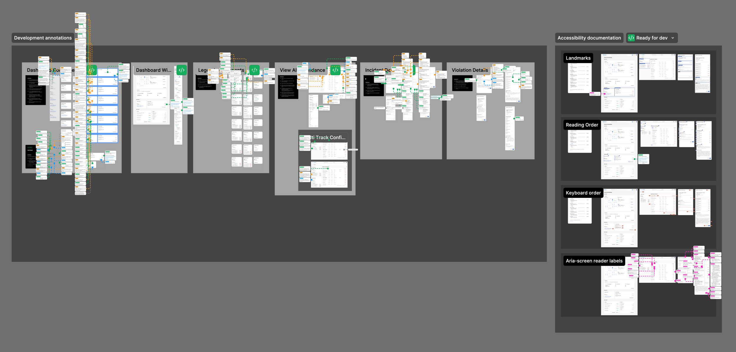
Accessibility annotations — full WCAG-compliant annotation set
Responsive specifications — behaviour documented across breakpoints

All work was marked ready for development.
Reflection
This was one of those features where the design problem wasn't inventing something new — it was making existing information legible. The data was there. The audit showed it clearly. The work was figuring out what employees actually needed to know, in what order, and surfacing it in a way that felt like it was working for them.
The threshold visibility piece is what I keep coming back to. You can show someone their score, but if they don't know what it means for their job, it's just a number. Making the policy milestone readable and present — not buried in an HR document — is the kind of detail that makes the difference between a feature employees actually use and one they ignore until it's too late.
The real complexity of attendance in Dayforce comes from the various policy configurations that are available for the clients. Every organisation has a different way of tracking its attendance; some have multiple violation tracks that can lead to a variety of outcomes. Dayforce is a flexible system that allows for all of those variants, and we needed to create a solution that would accommodate every client’s needs.