Why the clock matters more than anyone thought
The Dayforce Clock is a hardware device that sits in breakrooms, factory floors, and hospital corridors. For hourly employees, it's one of the most frequent touchpoints with their employer's technology — and it's not optional. The experience they have with it sets a tone: a clunky, confusing clock tells employees their time isn't valued. A clear, trustworthy one does the opposite.
Nobody had ever designed it with the employee in mind. The experience had been cobbled together over years of feature additions across multiple clock types and device sizes. Flows were inconsistent, the UI was outdated, and the interface gave employees no reason to believe their time was being tracked accurately. Most critically, the Clocks team had never had direct access to end-users. Every pain point they were working from was an assumption.
I was brought on as one of two product designers to redesign the clock experience from scratch.
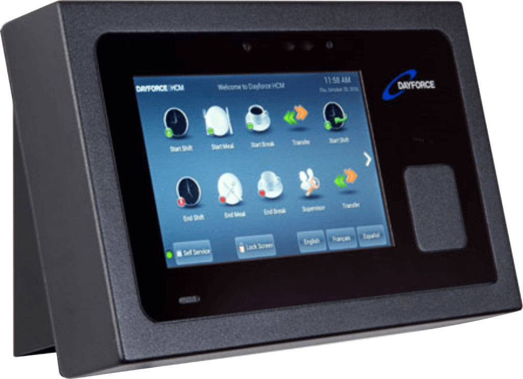
Dayforce touch clock hardware device
The finding that redirected the project
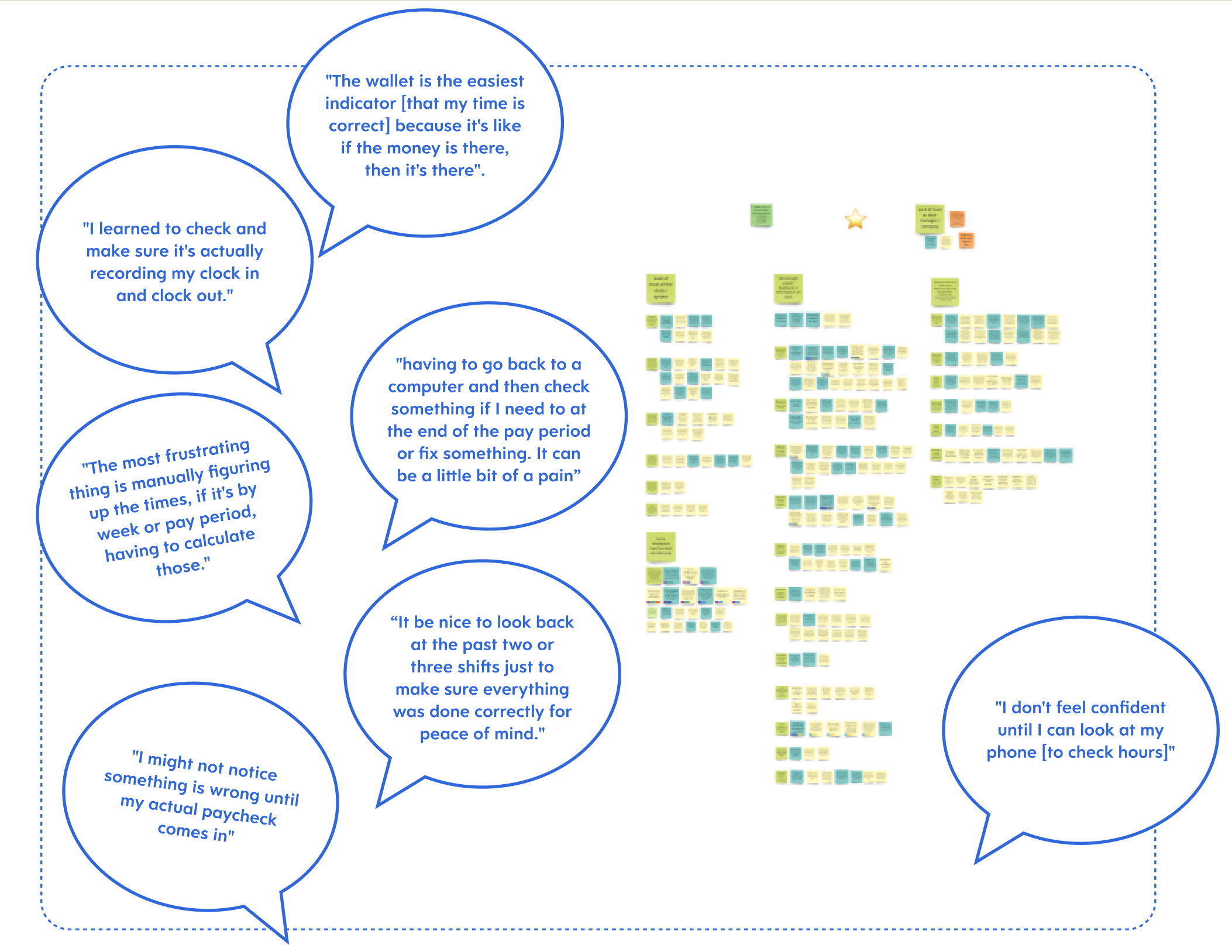
We ran 16 sixty-minute interviews with employees who use clocks daily. We went in expecting usability complaints — confusing buttons, slow screens. What we heard instead was an emotional pattern: employees didn't trust the clock. Not because it was broken, but because it never confirmed anything. No feedback that a punch registered. No way to verify hours were adding up. No reassurance that they wouldn't discover a payroll error two weeks later.
The recurring theme wasn't inaccuracy. It was silence. The clock didn't communicate, and that uncertainty followed employees through their entire pay period.
This finding fundamentally shifted the project. The team had been thinking about the clock as a feature modernization problem. The research reframed it as a trust problem — and trust required a different set of design priorities than a visual refresh.
The prioritization decision that defined V1
After synthesizing the research through affinity clustering and journey mapping, we had four clear opportunity areas: instilling trust in the clock, reassuring employees their time is tracked accurately, preventing forgotten punches, and reducing lines at the clock.
We also had a painful trade-off to make. Fixing punches — letting employees correct errors at the clock itself — was a huge pain point. Employees described tedious manual processes of finding a computer to submit corrections. But I argued that trust was more foundational. The data employees needed already existed in the system; it just wasn't being surfaced at the clock. If we got confirmation and transparency right in V1, every future feature (including punch fixing) would land on a stronger foundation.
We anchored this decision through a bullseye prioritization exercise I ran with the full cross-functional team — product, development, and design in the room together — using a Now/Next/Later framework. Having everyone participate in the scoping meant there were no arguments about scope later. Everyone had been part of the trade-off.
Designing for a 7-inch screen and a 3-second interaction
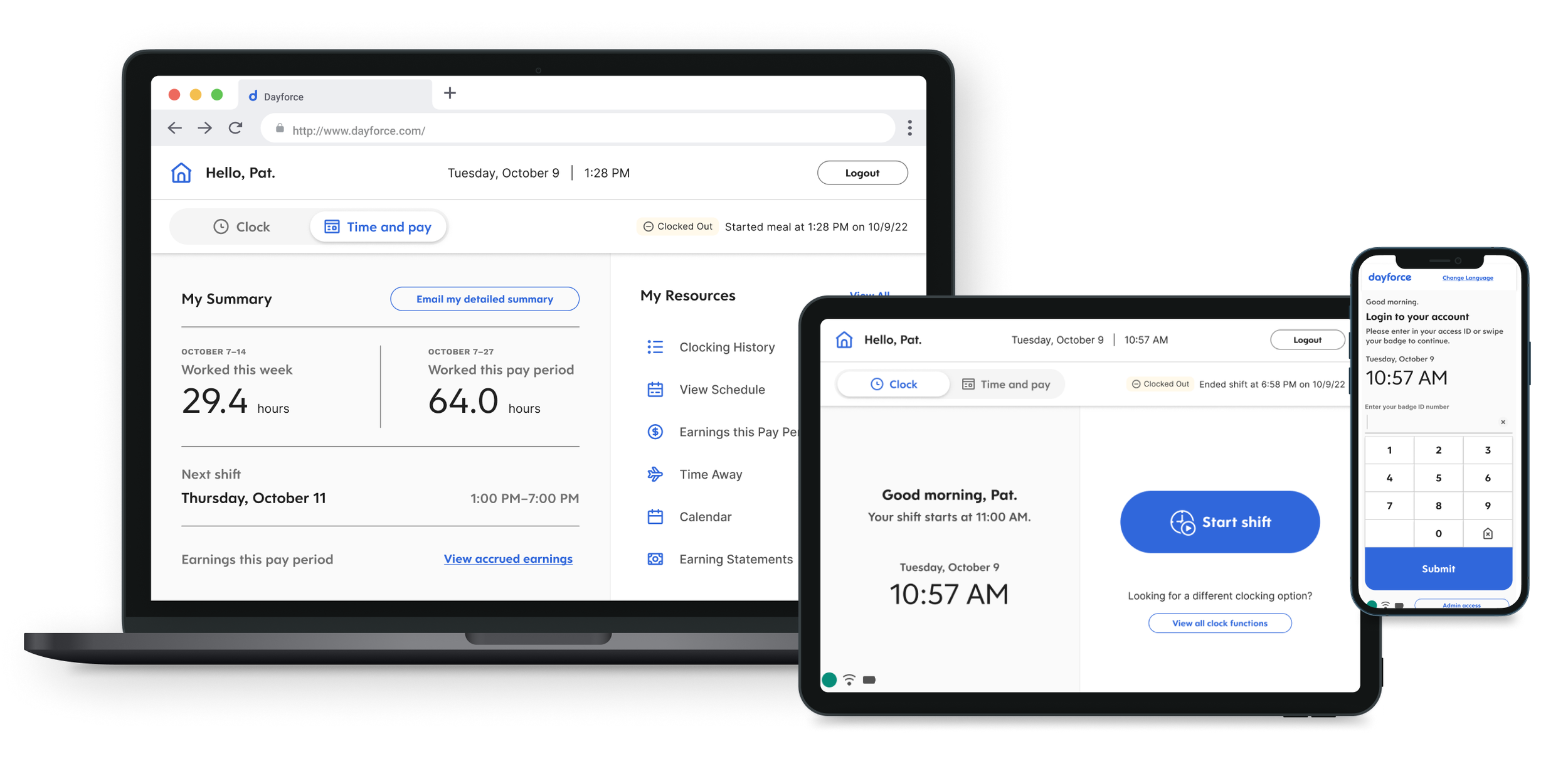
This wasn't a typical responsive problem where you reflow content across breakpoints. The interaction model itself had to adapt. On the clock hardware, I prioritized large touch targets, minimal text, and single-action screens. On desktop, I could afford denser layouts and multi-step flows. The design system we built had to accommodate both extremes without feeling like two separate products.
Designing for the small screen first turned out to be the best constraint we had. It forced a discipline of clarity and economy that made the desktop experience better too. When you have to make something work on a 7-inch screen where people are tapping quickly on their way to a shift, you learn exactly what information is essential and what's noise.
Low-Fidelity Prototypes
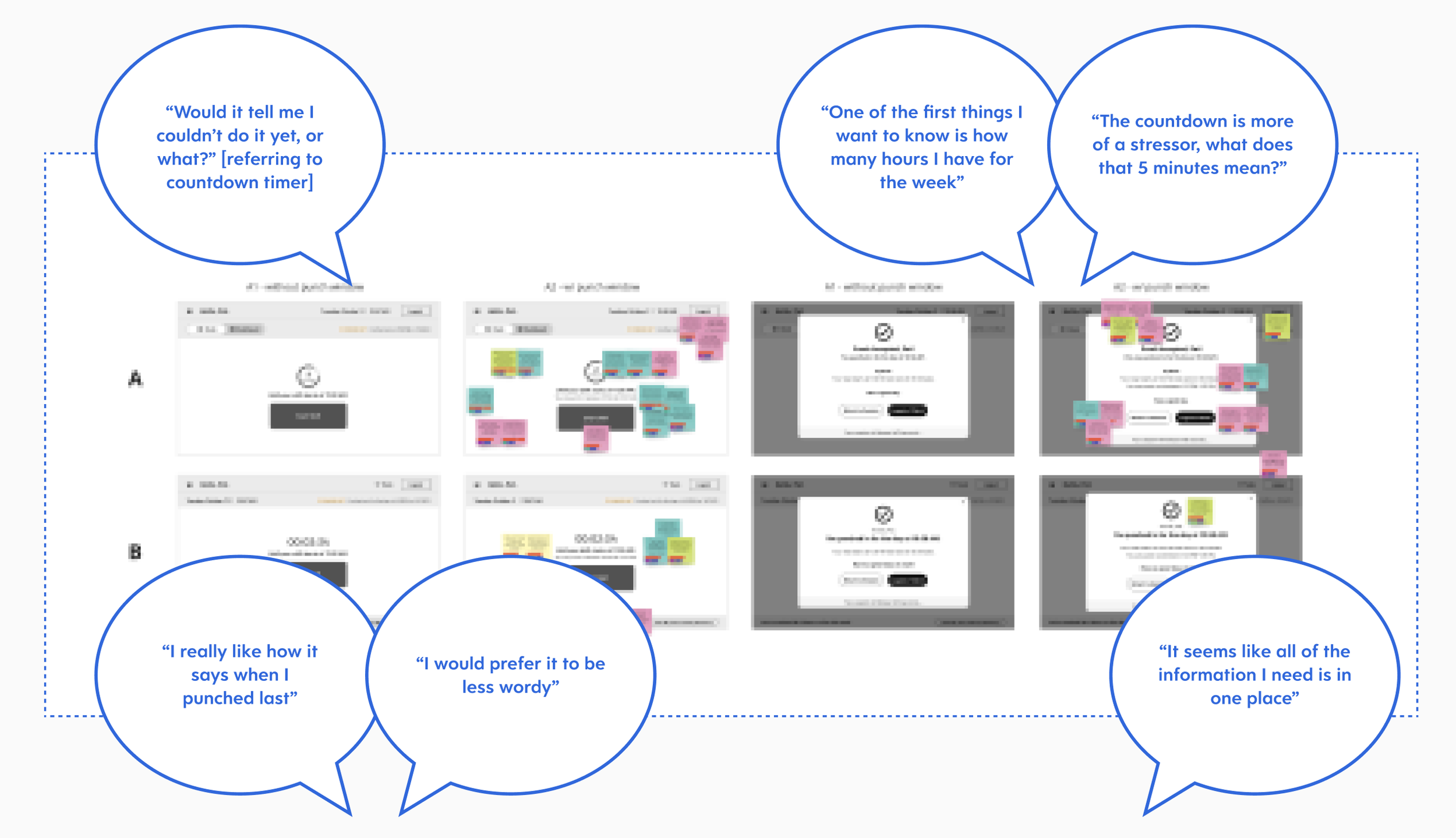
We started with low-fidelity prototypes to validate the core interaction patterns before investing in visual polish. These early concepts focused on the clock-in/clock-out confirmation flow — the moment where trust either gets built or broken. We tested these with real users in two rapid usability rounds, looking for whether the designs communicated status clearly and whether employees felt confident their time had been recorded.
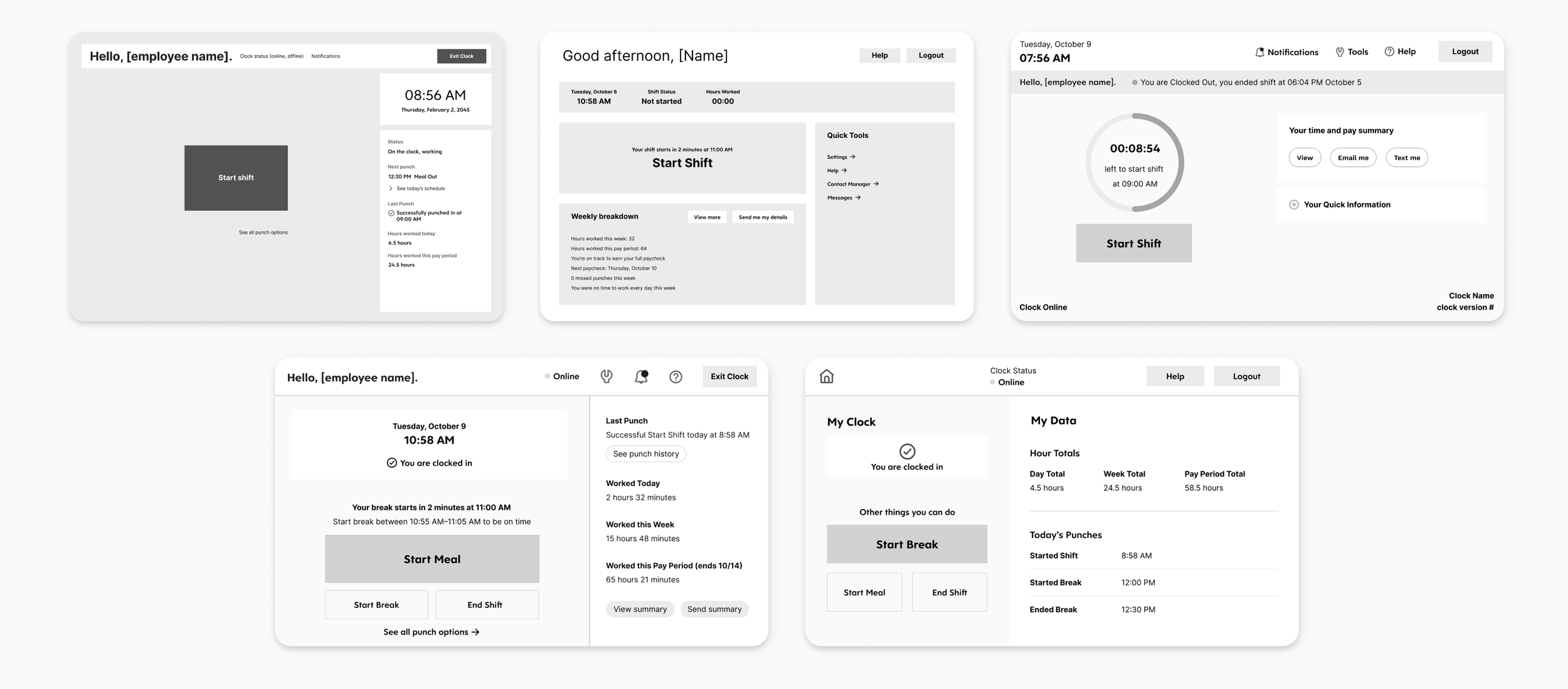
High-Fidelity Prototypes
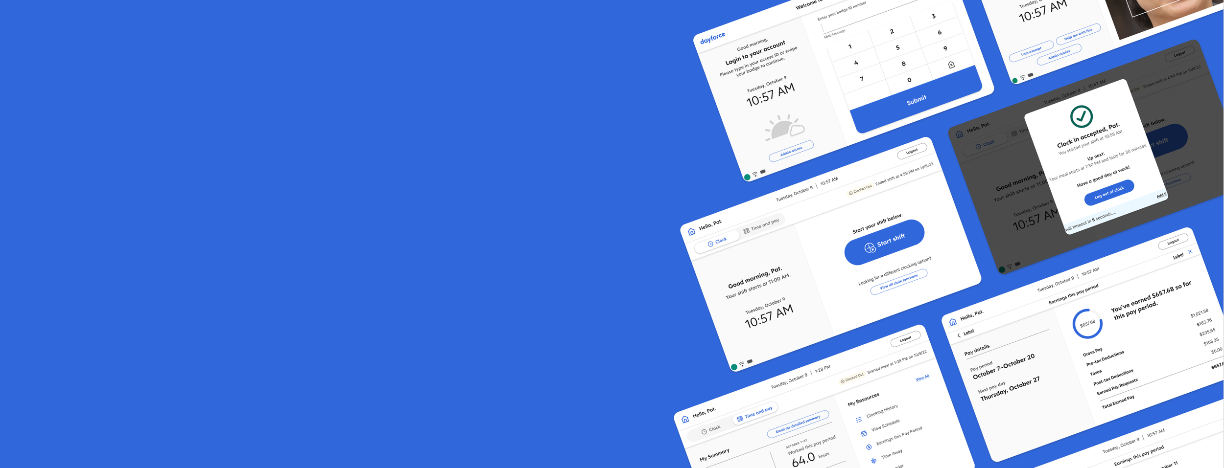
Based on what we learned, we moved into high-fidelity prototypes and ran two additional rounds of usability testing. The designs introduced personalized greetings (“Hello, [employee name]”), clear status indicators (“You are clocked in” / “You are clocked out”), and quick-glance summaries of worked time. We also designed flows for break and meal management — starting and ending breaks, viewing weekly breakdowns, and accessing earnings information.
Neither prototype round produced a clean winner. Instead, each round yielded a mix of elements that worked well and elements that needed refinement. We ran rose, thorn, and bud exercises after each round to systematically capture what was working (roses), what wasn’t (thorns), and what had potential but needed development (buds). This gave us a structured way to carry the strongest pieces forward while letting go of what wasn’t landing.
Key Design Decisions
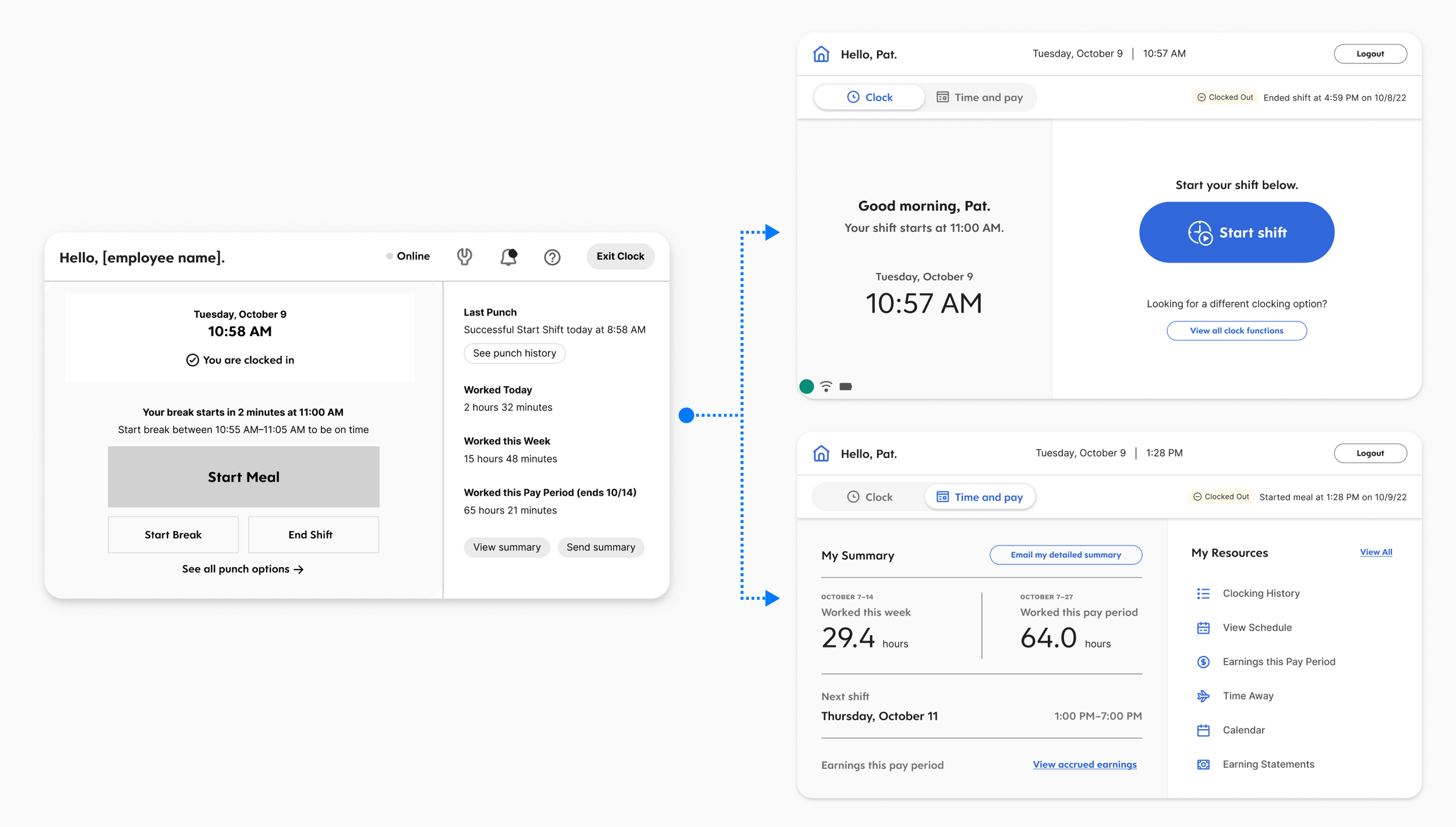
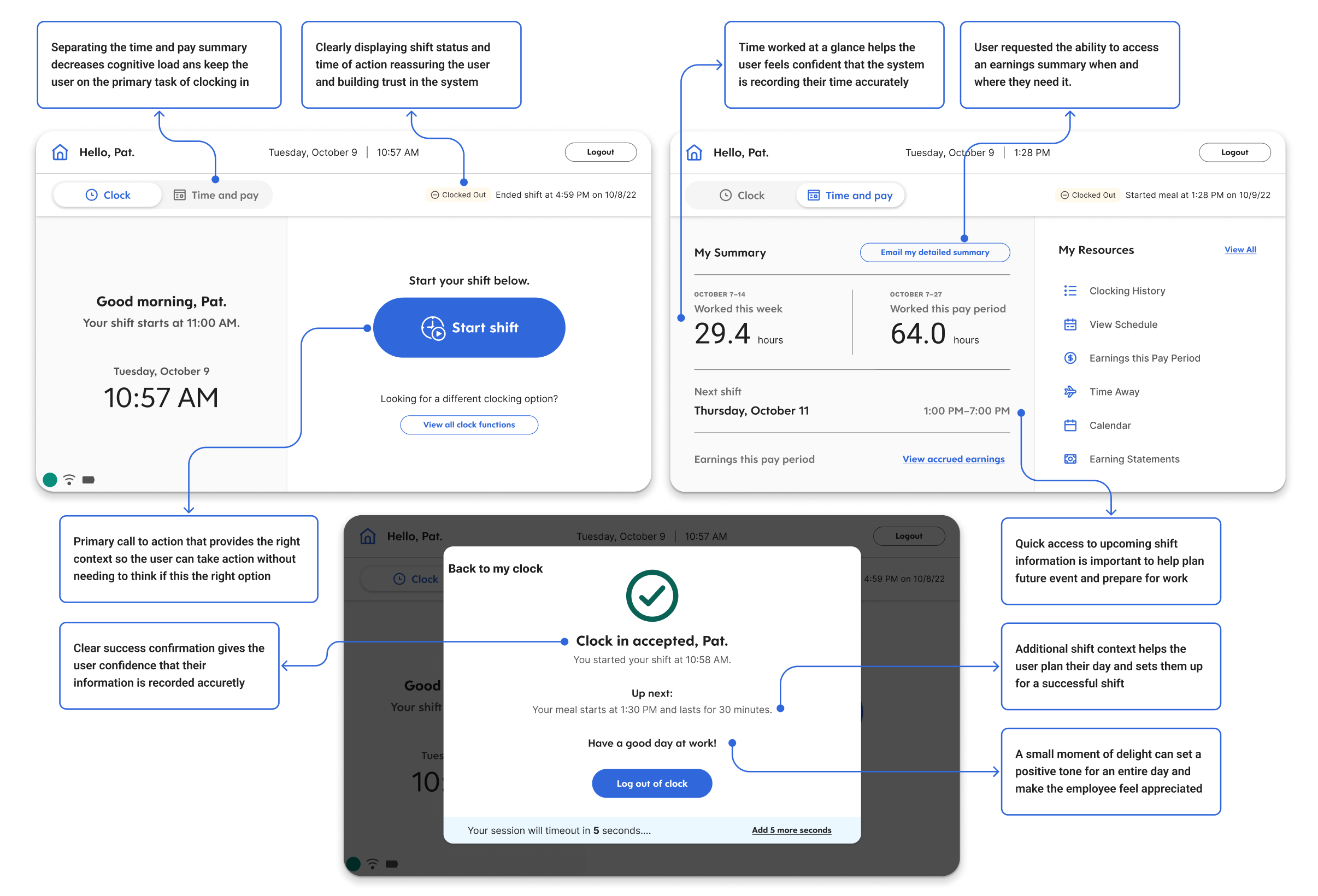
Confirmation as the core moment. Every punch — clock in, clock out, start break, end meal — now produces an immediate, unambiguous confirmation screen. This was the single most impactful change. It directly addressed the trust gap the research uncovered. Employees no longer had to wonder whether their action registered.
Surfacing time data proactively. After clocking in, the screen shows a summary of the employee's current period — hours worked, remaining in the shift, and quick access to recent shifts. This addressed the finding that employees were going to separate devices just to verify their hours. The data already existed in the system. I just brought it to the moment it mattered.
Personalization. Greeting employees by name and showing their specific status created individual recognition in what had been a generic, transactional interaction. In testing, this consistently surfaced as something that made the experience feel different — like the system knew who they were.
Progressive disclosure across form factors. On the clock, only the most critical information and actions. One tap deeper for weekly breakdowns, earnings, and historical data. On desktop, more of this could live on the primary view. The hierarchy stayed consistent; the density adapted.
Documentation and Handoff
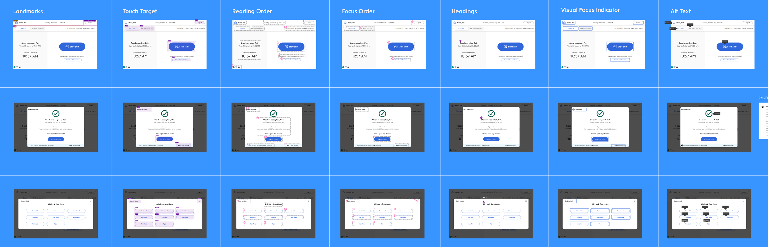
The handoff package included high-fidelity final templates with UX annotations, interactive flows and prototypes for developer reference, comprehensive accessibility annotations (screen reader order, focus order, reading order, and keyboard navigation), and a component and style library with net-new clock-specific components that extended the existing Dayforce design system.
The accessibility work was particularly important given the context. Clock hardware is used in environments where employees may have varying abilities, and the web application needed to meet enterprise accessibility standards. We documented screen reader flows, keyboard navigation paths, and focus management for every screen and interaction.
How we validated
We moved through four rounds of usability testing — two low-fidelity, two high-fidelity. Neither round produced a clean winner, which was exactly the point. Each round yielded a mix of elements that worked and elements that needed refinement. After each round, I ran rose/thorn/bud exercises to systematically capture what to carry forward, what to discard, and what had potential but needed development.
This iterative structure — test, synthesize, carry the best pieces forward — meant the final design was genuinely earned rather than guessed at. By the time we reached handoff, engineers understood the rationale behind every decision because they'd been part of making them.
Impact
Reduced average clock interaction time by 35%
At 1.68 billion entries per year, even a 1-second improvement per interaction saves approximately 26,000 worker-hours annually
First clock experience designed with direct end-user research input in the product's history
Established a design system that bridges hardware touchscreen and desktop web contexts
The metric I care about most isn't the time savings — it's the shift in how the team works. The 16 user interviews we conducted didn't just inform the redesign. They gave the Clocks team its first direct connection to end-users, fundamentally changing what they built on going forward.