Rethinking a 20-year-old enterprise tool from the ground up
Dayforce's scheduling feature was originally built in the early 2000s with minimal designer involvement. Over two decades it had accumulated features, but the core interaction model never fundamentally changed. It was designed in an era when enterprise software didn't prioritize usability — it just needed to be functional.
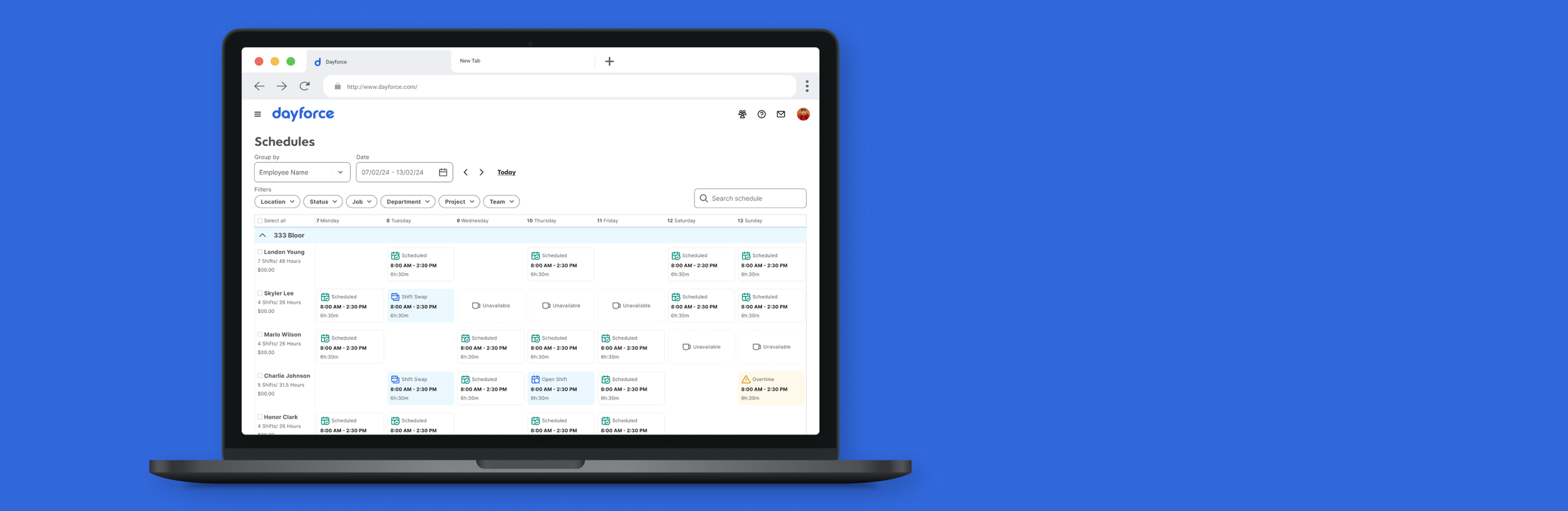
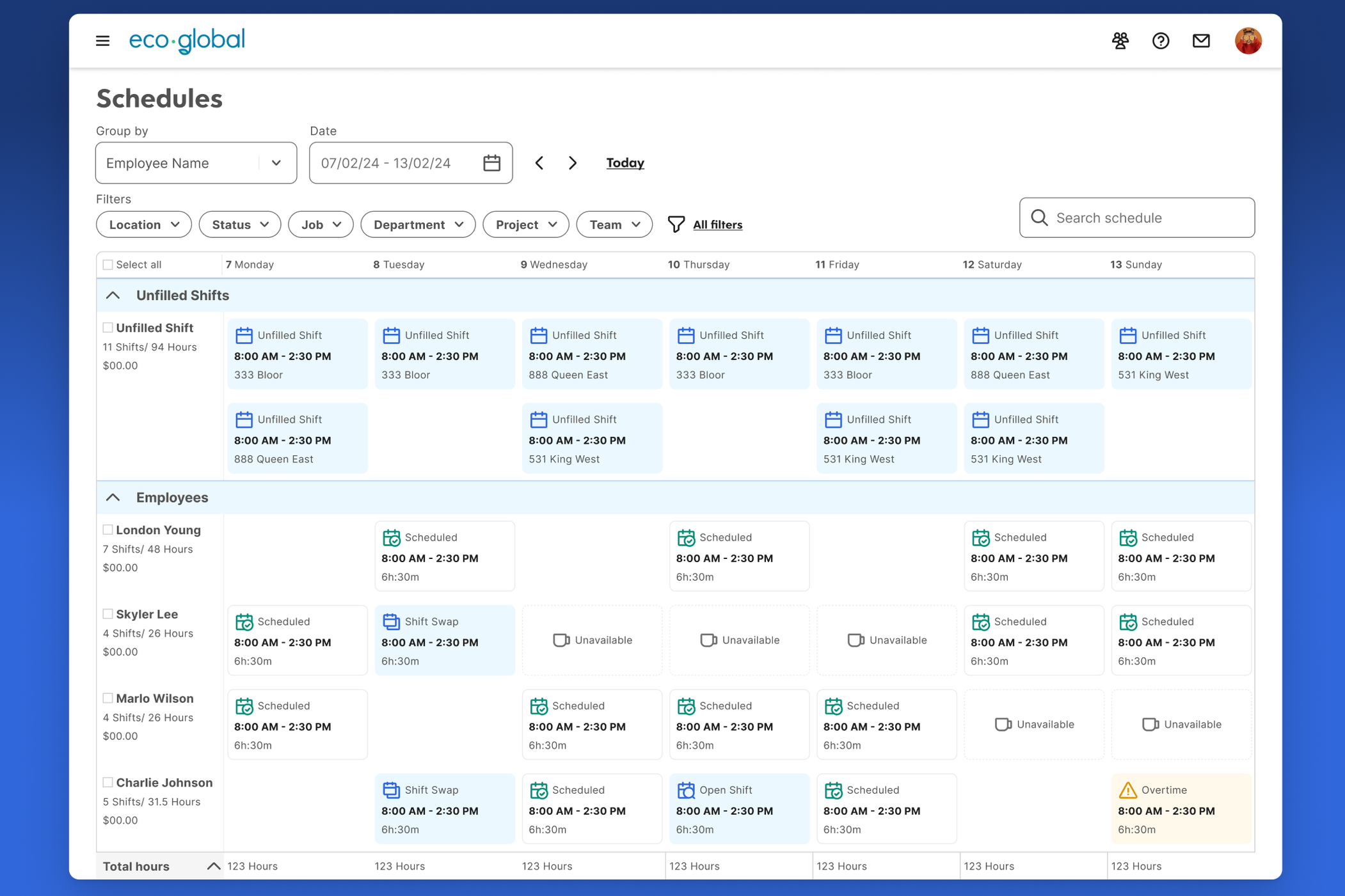
For managers, the schedule is where they spend a significant chunk of their week: building out who works when, juggling availability and labor budgets, filling gaps when someone calls in sick. For employees, it's the single most important thing the software gives them — it tells them when to show up. The interface was cluttered, workflows that should have been straightforward required multiple clicks and modal dialogs, and there was no clear visual hierarchy to help managers scan a week's worth of shifts at a glance.
This wasn't a polish project. This was a ground-up redesign of one of the platform's flagship features.
Standing on existing work instead of starting over
There was already a body of research and ideation — user interviews, survey data, internal stakeholder feedback — that previous teams had produced. The instinct on a project like this is to want to run everything fresh. I think that instinct is usually wrong.
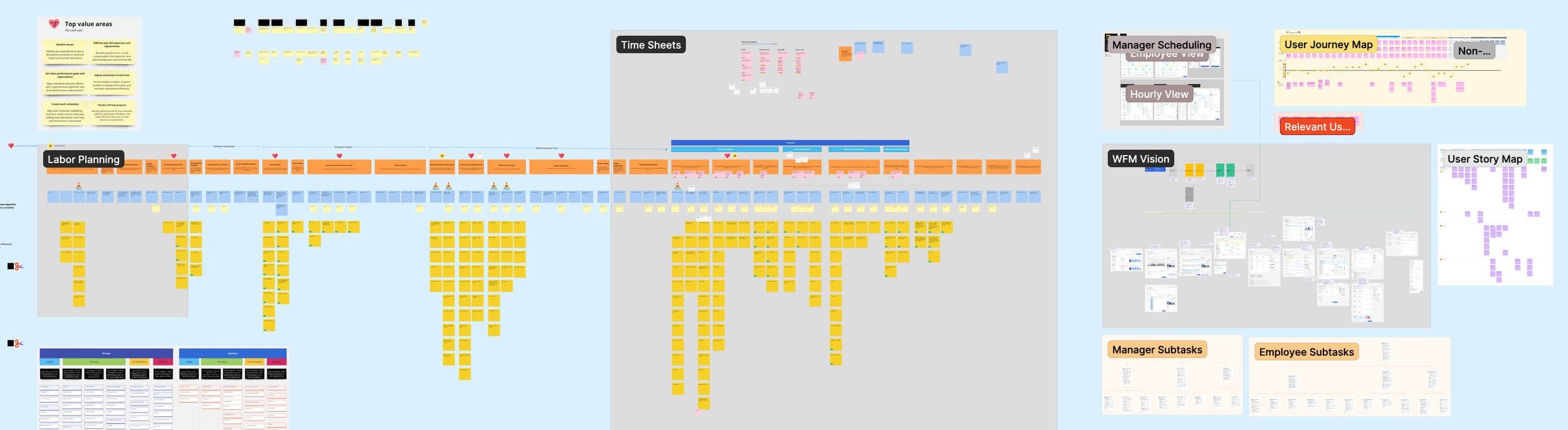
Previously conducted research and ideation board — synthesis of existing findings
I spent the first phase synthesizing what already existed to identify where the real gaps were and what I could build on. This saved weeks of discovery time and let me focus my research energy on the questions that were actually unanswered rather than re-establishing what was already known.
Audit of the existing schedule creation experience — showing the legacy UI and its pain points
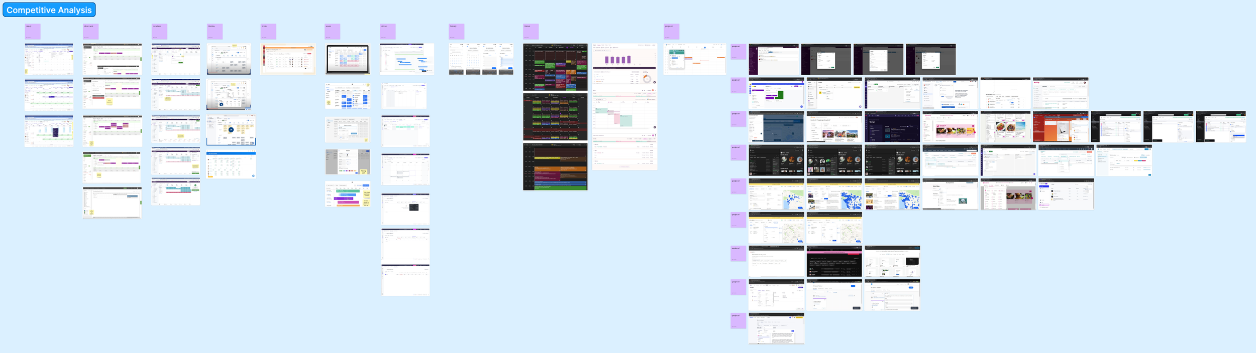
Competitive analysis board — screenshots and annotations across multiple scheduling products
I supplemented this with a competitive analysis across scheduling tools — both direct WFM competitors and adjacent products that handled scheduling in interesting ways. I documented how each product handled core tasks: viewing the weekly schedule, creating shifts, managing conflicts, publishing. This gave me a shared reference I could bring into conversations with product and engineering — concrete examples of where the market was and where we had room to differentiate.
Mapping the full journey to have honest scope conversations
I created an end-to-end journey map capturing the scheduling experience for both managers and employees. For managers: Schedule Prep, Schedule Creation, and Shift Monitoring. For employees: Work Prep, Schedule Collaboration, and Task Tracking. I mapped user stories, base features, and additional features across each phase for both roles.
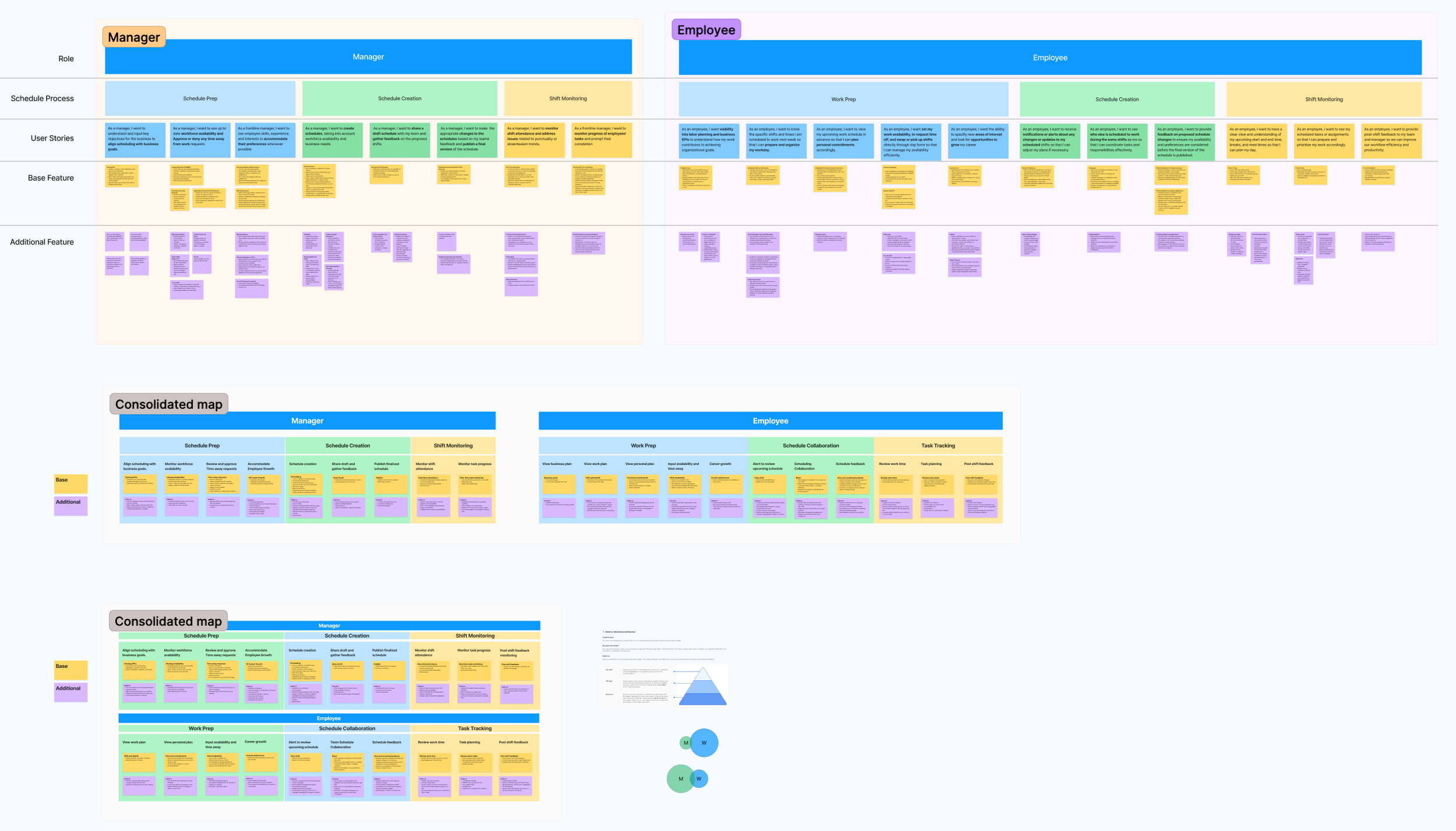
The map's real value wasn't as a design artifact — it was as a scope negotiation tool. When you can see the entire journey laid out, including all the edge cases and secondary workflows that make scheduling complex, it becomes much easier to have an honest conversation about what's V1 versus what comes later. Without it, every stakeholder conversation becomes a negotiation about individual features. With it, you're having a conversation about the whole system.
Narrowing down the feature mapping frameworks
I facilitated a bullseye exercise — a workshop where we collaboratively sorted features into Now/Next/Later — to narrow V1 to the core scheduling workflows with the biggest impact: how managers view, create, and manage their weekly schedules. Having the team participate in this prioritization (rather than presenting a recommendation) meant the scope boundaries had genuine buy-in.
This map became a critical alignment tool. It let me have honest conversations with stakeholders about scope. When you can see the entire journey laid out, it becomes a lot easier to have the conversation about what’s V1 versus what comes later.
Writing the brief before drawing the screens
Before sketching anything, I wrote a design brief that captured the problem statement, the opportunities, scope boundaries, key metrics, and a 6-week cycle plan. The first version was deliberately exploratory — I used it to pressure-test my framing with the team and get feedback on whether I was even asking the right questions. The final version was tighter and more opinionated, and it became the north star for everything that followed.
I'm a strong advocate for design briefs on projects of this scale. They force you to articulate what you're solving before you start designing, and they give stakeholders something concrete to react to. Course-correcting at the brief stage is orders of magnitude cheaper than course-correcting after a full prototype.
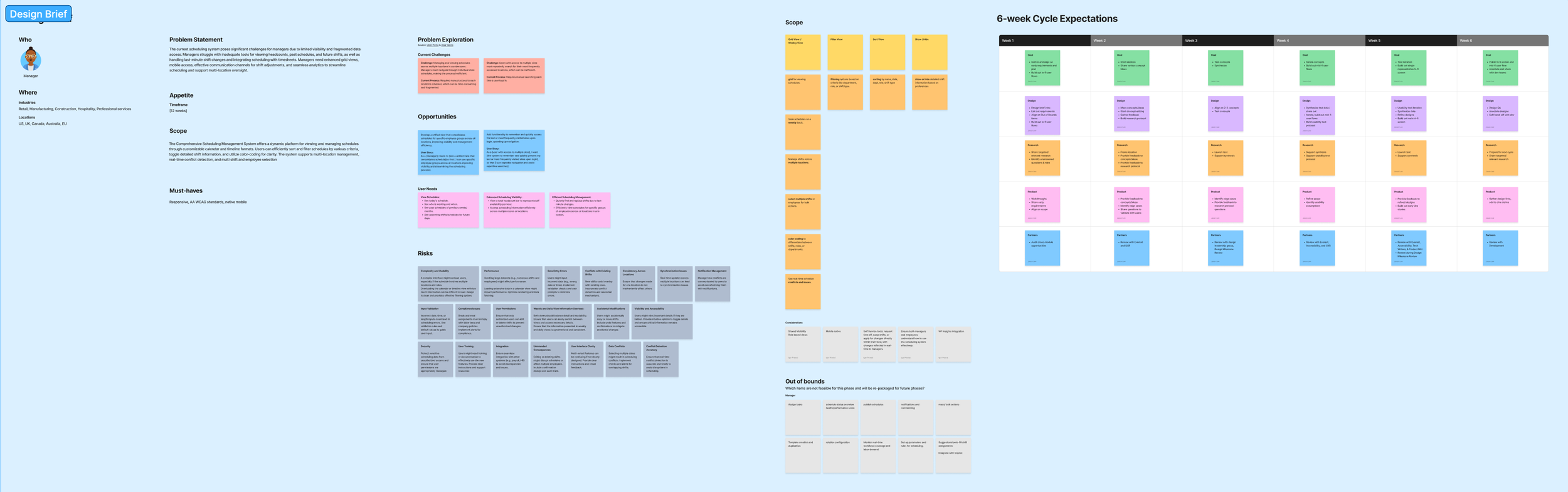
Final design brief — refined problem statement, 6-week cycle expectations, and success metrics
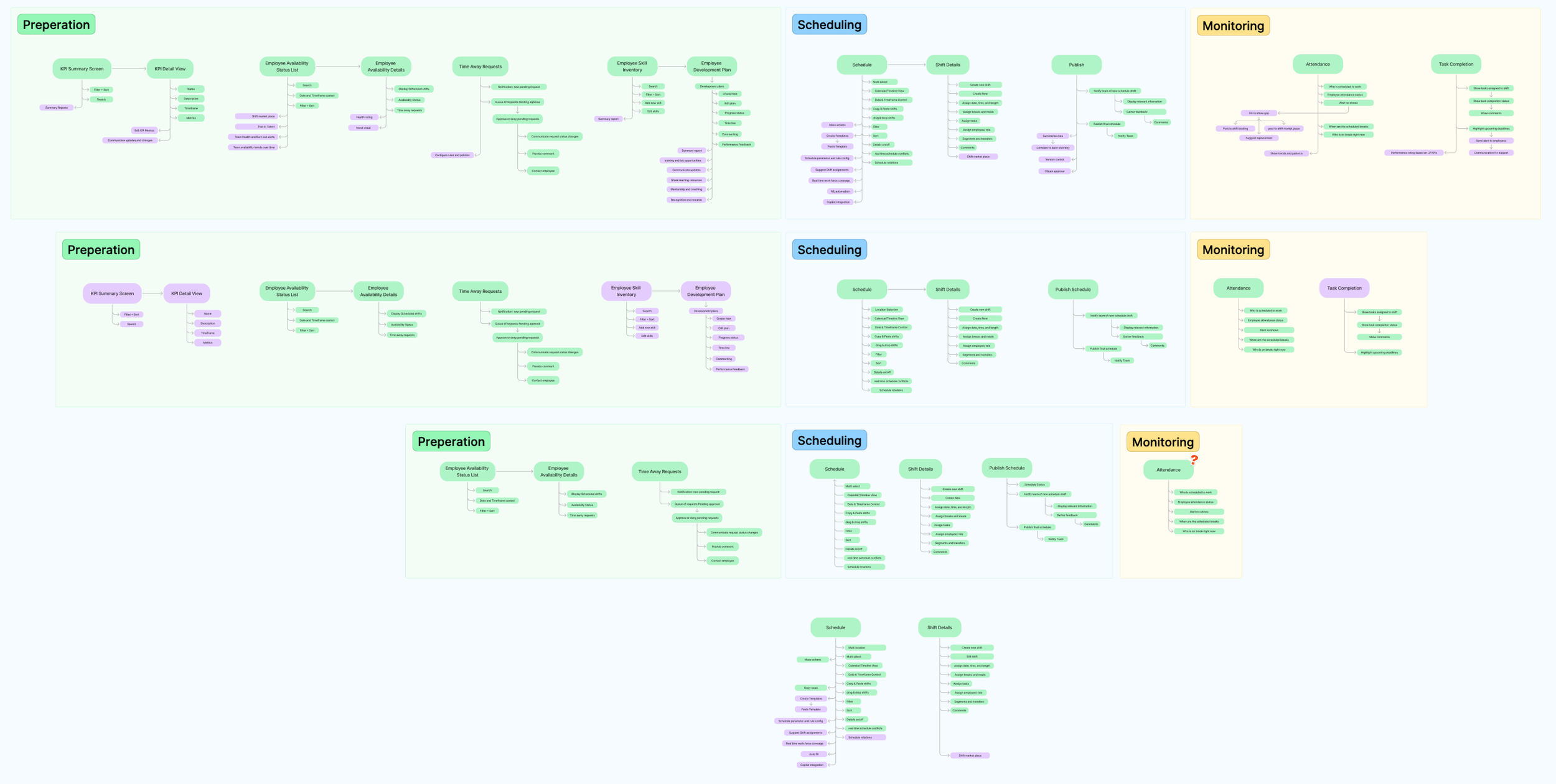
Task Flow Definition
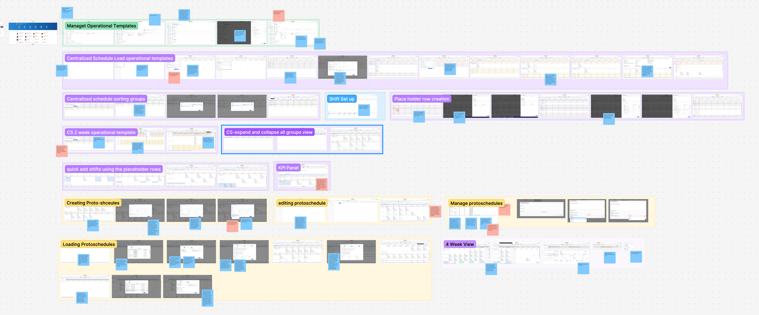
Before jumping into UI design, I mapped out detailed task flows for the key interactions defined in the design brief. These flows captured the step-by-step logic of how users would move through core tasks—date and location selection, filtering and sorting, view options, schedule creation, and more.
I created multiple versions of these flows, iterating on them as I refined my understanding of the interaction model. The flows served as a bridge between the strategic thinking in the design brief and the tactical decisions I’d need to make in the UI. They helped me think through edge cases early—what happens when a manager oversees multiple locations? What’s the flow when there’s a conflict? How does filtering interact with the schedule view?
I also mapped a higher-level end-to-end task flow that showed how the manager and employee journeys intersected, including handoff points like schedule publishing and shift swap requests. This was useful for making sure the redesign didn’t just optimize one role’s experience at the expense of the other.
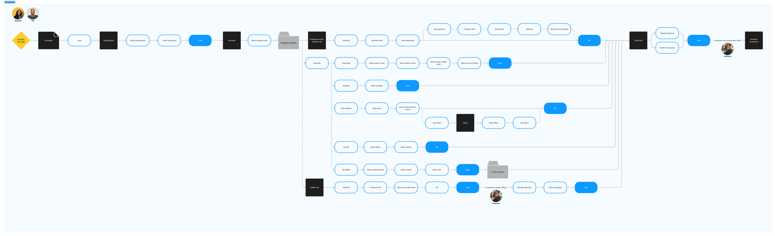
End-to-end task flow — Manager and Employee journey intersection with handoff points
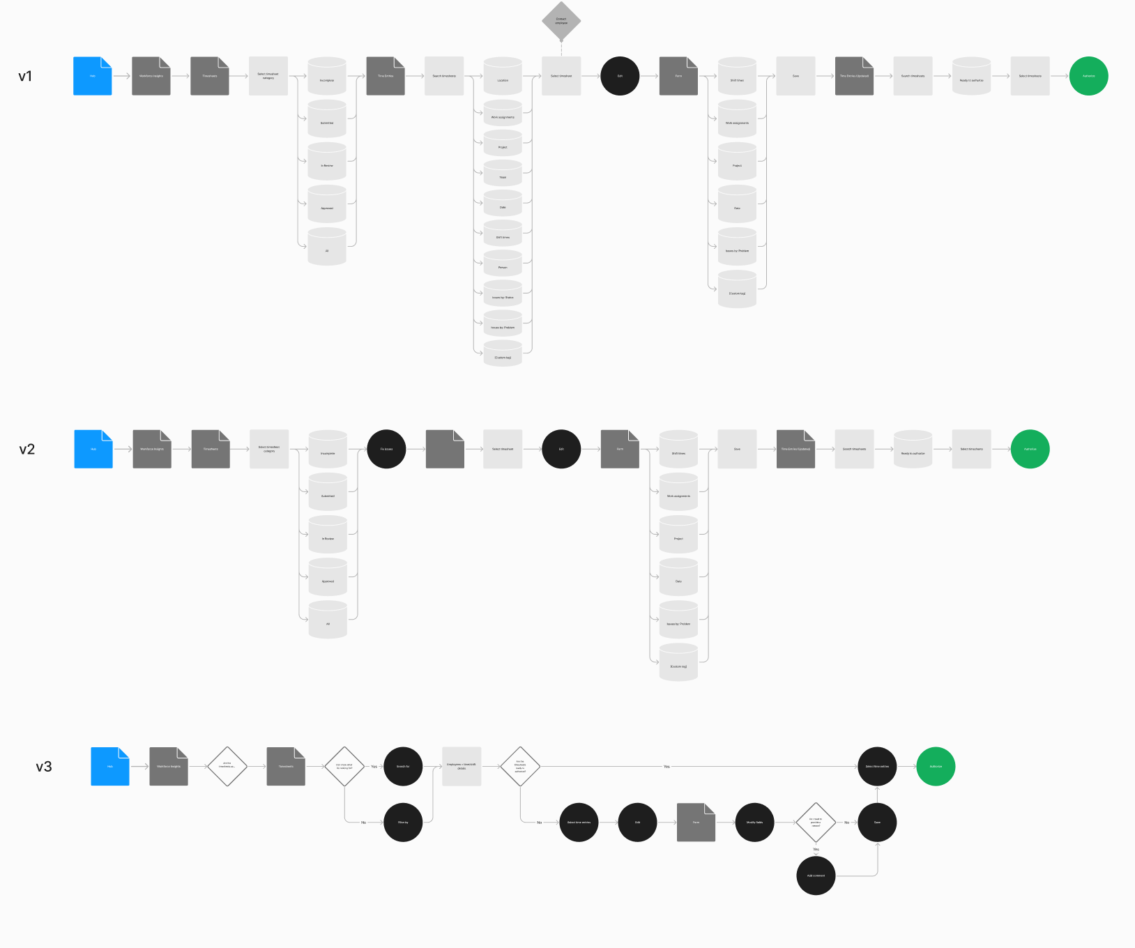
Task flow iterations (v1, v2, v3) — showing progressive refinement of the creation flow
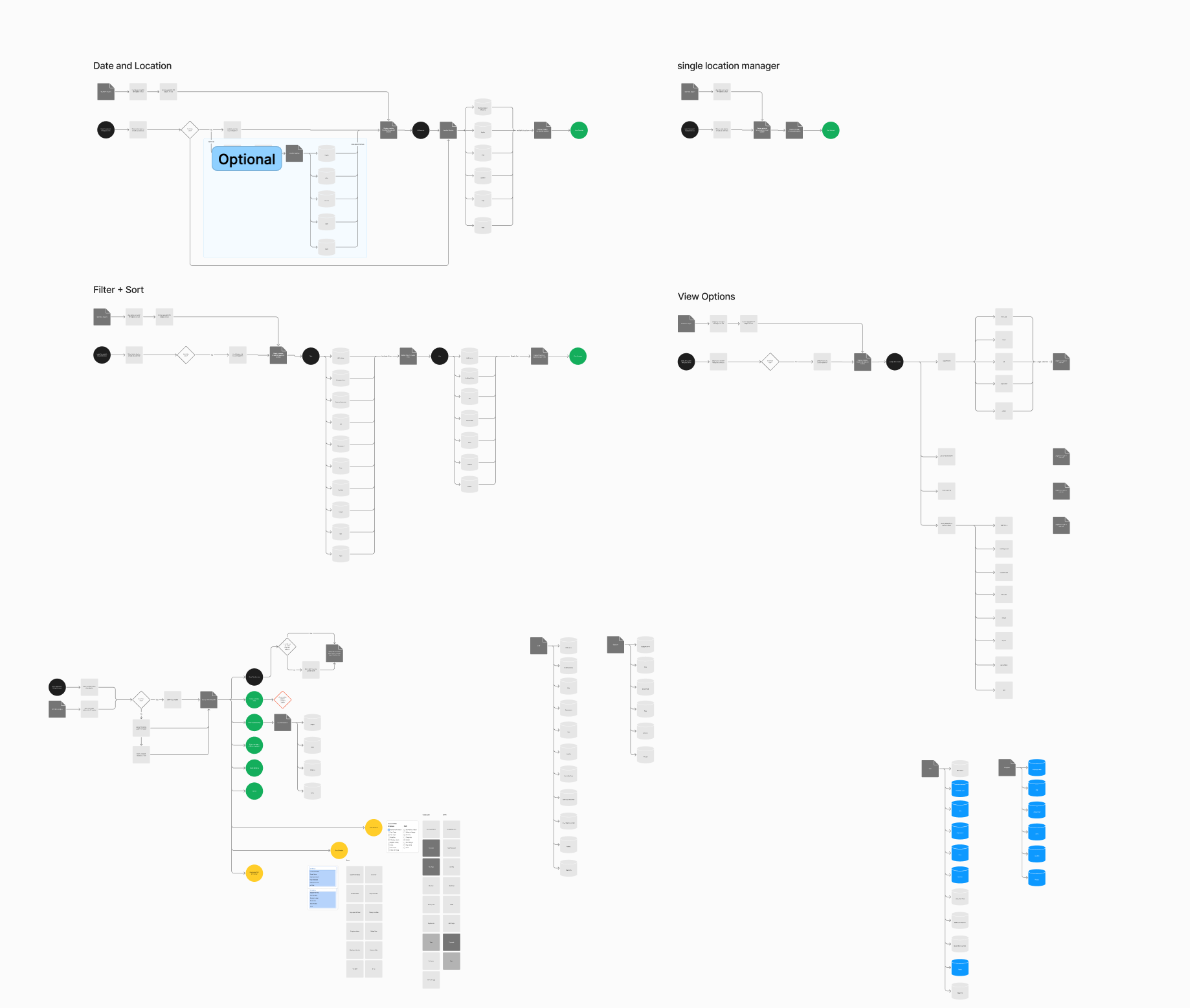
Task flows — Date/Location selection, Filter + Sort, View Options, and Single Location Manager flows
Two concepts, tested against each other — on purpose
With the groundwork laid, I moved into design exploration. The first round of ideation was broad and intentionally divergent—I was trying to explore fundamentally different approaches to how a schedule could look and feel, not just iterate on what already existed.
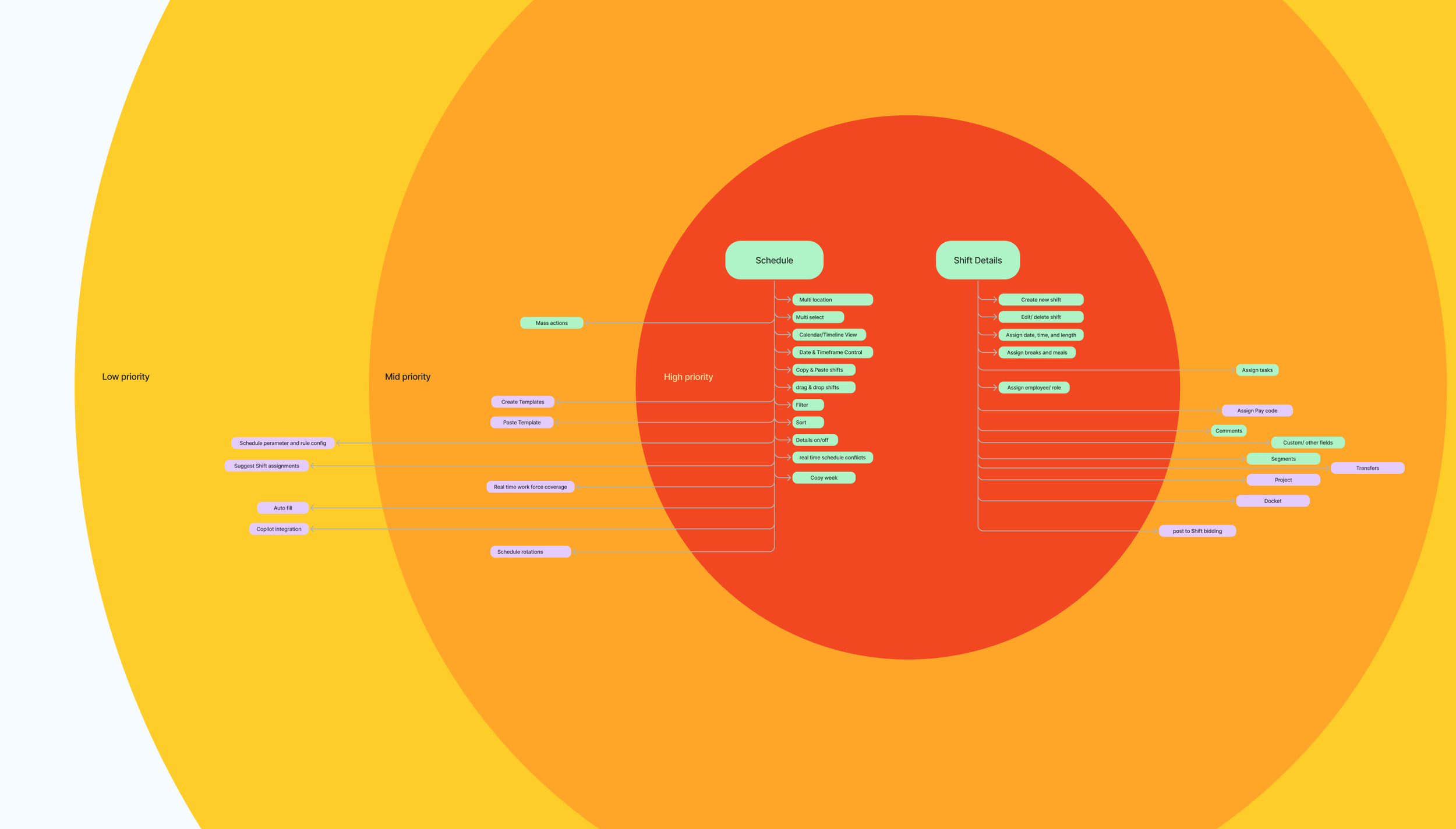
This exploration led me to two distinct concepts. They differed in how they organized information, how they handled the density of schedule data, and how they balanced the need to see the big picture with the ability to drill into individual shifts. I explored variations on layout, data density, color coding, and interaction patterns.
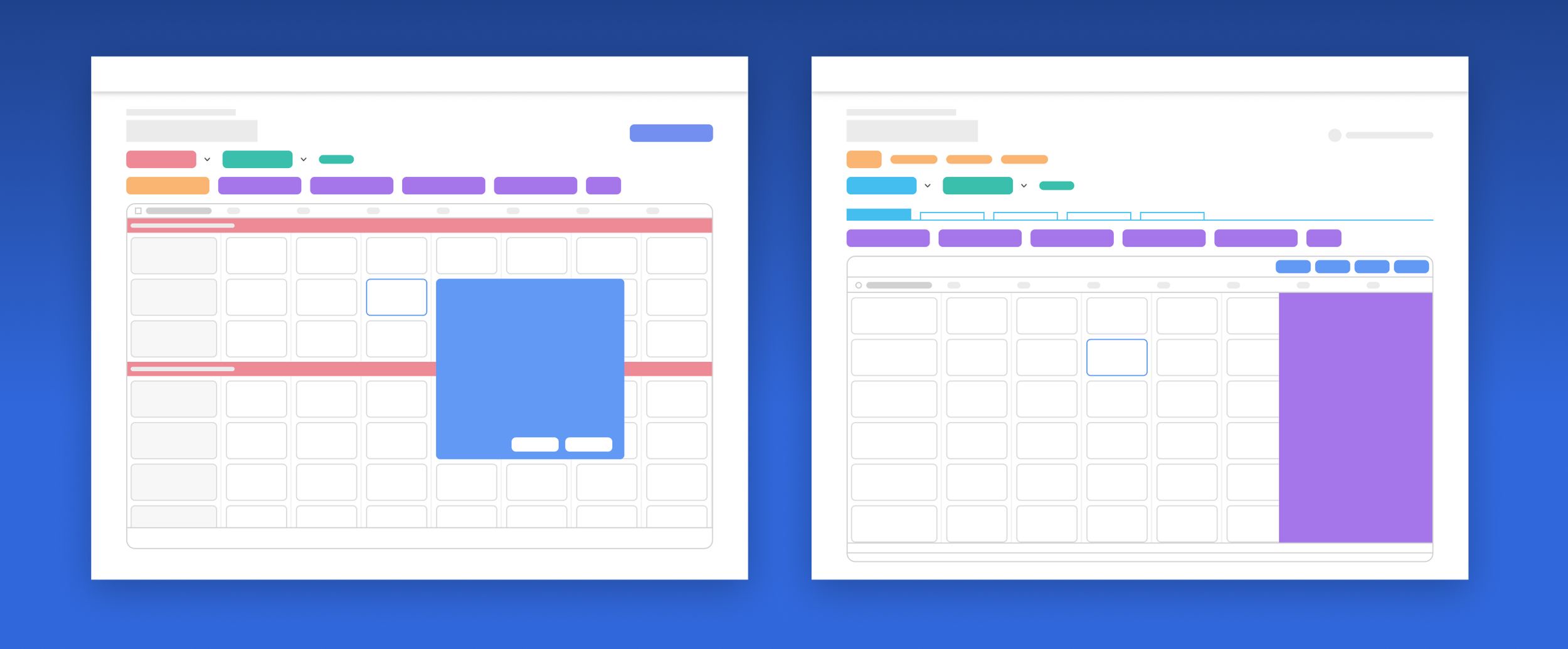
First round of ideation — two distinct design concepts with layout and interaction variations
I turned both concepts into interactive prototypes and ran an A/B usability test with real users across three core scheduling tasks. The goal wasn't "which one do people like more" — it was understanding which interaction model better matched the mental models managers already had.
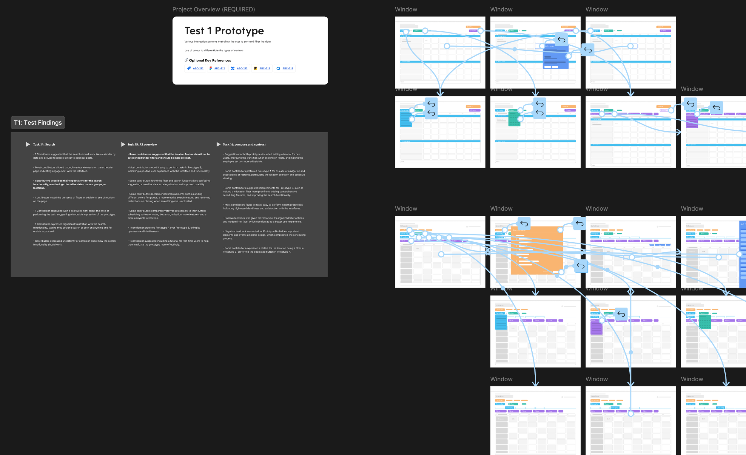
The results were genuinely useful because they were mixed. Users responded to the data organization from one concept and the interaction patterns from the other. Key findings: users wanted easy access to group, filter, and multi-location controls; contextual pop-ups for shift details tested better than slide-out panels; group sections worked better inside the grid than as external tabs; and search was expected as a drill-down tool for large datasets.
A second round of focused exploration synthesized the strongest elements from both concepts, with particular attention to the data visualization layer — how to display a week of shifts for dozens of employees in a way that's scannable and actionable without feeling cramped. I explored multiple approaches to data density, color systems, row heights, and default-vs-hover information hierarchy. The synthesized direction tested better than either original concept, confirming the approach was working.
Second Prototype Test
This refined direction was built into a second prototype and tested with users. The second test helped validate the synthesized approach and surface remaining friction points. It was encouraging—the combined direction tested better than either of the original concepts on their own, which confirmed that the synthesis was working.
Editing and publishing: where the real complexity lives
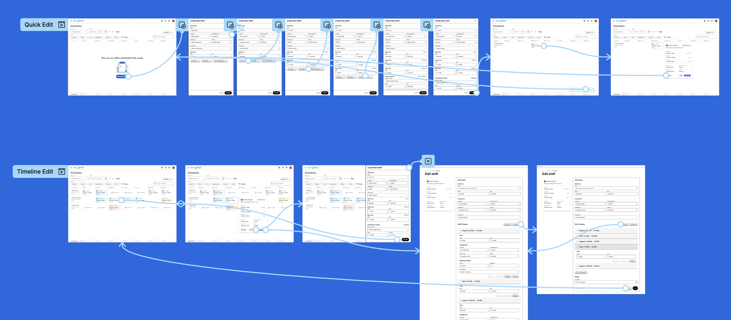
With the viewing experience validated, I moved into editing and publishing workflows. Schedule editing is where complexity concentrates — managers need to modify shifts, swap employees between positions, and fill gaps when someone is unavailable, all while balancing availability, qualifications, overtime rules, and labor budget.
I explored inline editing, drag-and-drop, and quick-action patterns using low-fidelity prototypes. Filling empty shifts was a particularly interesting design problem because it involves surfacing multiple constraints in context — who's available, who's qualified, what the overtime implications are — so managers can make informed decisions without leaving the schedule view.
Where the project stands
I was deep in this work when my son was born in early 2025, and I went on parental leave in February. At that point, the design had progressed through two rounds of concept exploration and testing, detailed interaction design for viewing, editing, and publishing workflows, and was approaching the engineering handoff phase. The design direction was adopted by the team and is currently in engineering implementation.
The work I delivered established a validated design direction, a comprehensive set of task flows and interaction patterns, and a strategic framework — journey map, bullseye prioritization, design brief — that the team could continue building on. Redesigning a feature with 20 years of accumulated complexity, established user habits, and deep technical constraints is inherently messy. Moving from "this hasn't been meaningfully touched in decades" to a tested, validated new direction in a matter of months was the kind of progress that mattered.