Workforce Management Navigation — Untangling IA for Managers and Employees
This product is used by two very different audiences: small business owners/managers running day-to-day operations, and hourly employees trying to figure out what’s next—when to work, when to clock in, how to swap shifts, and how to stay in the loop. It runs across desktop web and mobile, and like a lot of long-lived products, the navigation had slowly drifted as new features were added over time.
By the time I led this work, the nav wasn’t “broken” in one obvious place. It was worse than that: it was inconsistent. Labels didn’t always mean what users thought they meant, key workflows were scattered, and switching between manager and employee contexts created constant “wait…where am I?” moments.
My role
I was the Senior Product Designer on the effort, partnering with the Head of Product and a Design Lead. I owned the IA strategy, ran the workshops, built the sitemaps, and created wireframes to validate a recommended direction.
This work didn’t reach implementation—after we completed discovery and a proposed IA + wireframe exploration, the project was deprioritized due to shifting business priorities. But the problem was real, and the proposal created a direction the team could return to when the timing was right.
What kicked this off wasn’t “menu aesthetics”—it was operational friction
As the product grew, the navigation became harder to understand in predictable ways:
Features ended up scattered across the UI based on when they shipped, not how people actually work
Labels drifted and became inconsistent (sometimes internal, sometimes customer language)
Users struggled to find key tasks, which showed up as lower task success and higher support burden
Switching roles (manager vs employee) amplified confusion instead of reducing it
But the biggest issue we kept running into wasn’t just “too many items.” It was scope confusion.
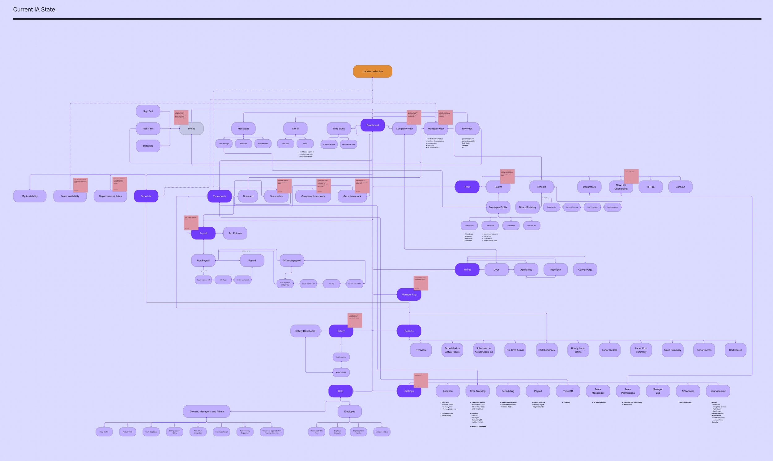
side by side comparison of the current navigation structure and the areas highlighted in red are the key areas of focus for improvement in the proposed IA structure
The real structural problem: Company vs Location (and the product didn’t commit)
The product had a location picker in the top-right of the web app, so users naturally assumed: “I picked a location, now I’m looking at that location.” Except that wasn’t consistently true.
Some areas honored location, others ignored it, and some introduced special cases to explain the mismatch (things like “Company View” or “Company Level” sprinkled in). Over time, the UI taught users a bad lesson: you can’t trust the context you’re in.
That kind of inconsistency is brutal in workforce software, because managers are often moving fast—checking yesterday’s performance, approving requests, fixing timecards, resolving exceptions. If the system silently changes scope depending on where you are, users spend mental energy just figuring out what they’re looking at.
Why it mattered beyond usability
Location historically mattered a lot because it was tied to billing. But the business was moving toward employee-based pricing at the company level, which meant location would become less central over time. That made it even more important that the IA could scale toward company-level clarity, instead of relying on location-driven exceptions forever.
So we framed the work around a simple principle: make context explicit and predictable—role, scope, and intent.
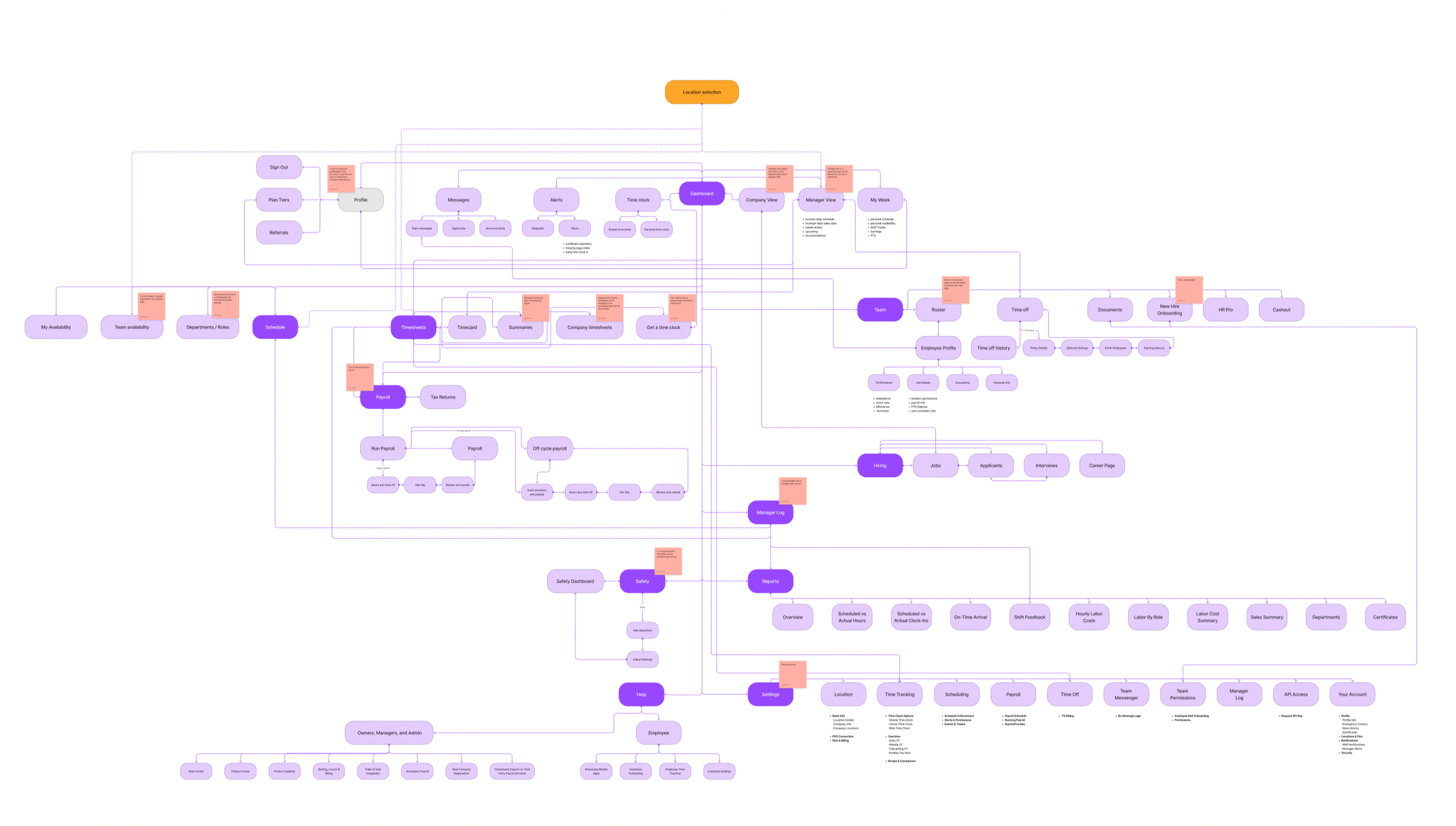
Mapping out the current state of the web application and identifying problematic information architecture structures
We anchored the structure on what people actually do (jobs to be done)
Instead of arguing about menu names in the abstract, we grounded the IA around high-frequency tasks for each role.
Managers/owners were trying to:
Monitor sales + labor from the previous shift
View projections (permission-based)
Track no-shows
Approve/deny trade and cover requests (including seeing requests not yet picked up)
Resolve timecard errors
Send/receive messages and announcements
Manage event reminders
Employees were trying to:
See upcoming shifts with context (hours, coworkers, notes, messages/events)
Act on clock-in timing (notifications + entry point)
Request and track trades/cover requests
View announcements, events, and messages
Review previous shifts (sometimes including earnings)
When we stepped back, it was clear the product was asking both audiences to navigate the same maze. The IA needed to reflect that these are two different modes with two different mental models.
The direction we aligned on: make “where am I?” unmissable
We aligned on success criteria that were intentionally practical:
Fewer clicks to key tasks
Less confusion when switching roles and locations
From there, the IA principles almost wrote themselves:
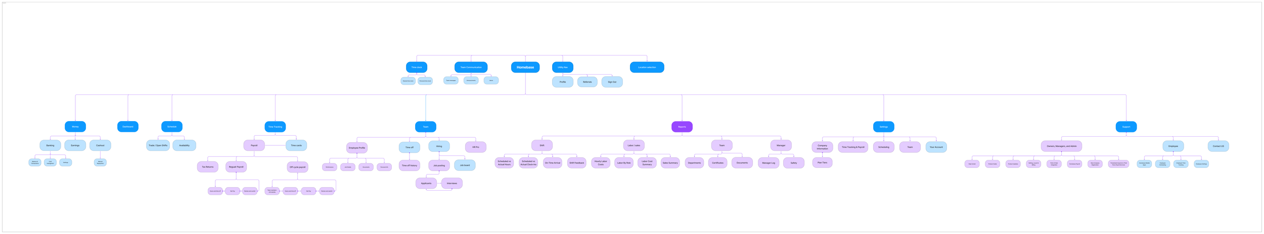
Separate Manager and Employee spaces with explicit mode/context
Group navigation into scalable modules (Scheduling, Payroll, Team, Hiring, Reports, etc.)
Organize by intent where it helps, especially on mobile (e.g., “My Work” vs “My Money”)
Use role-specific landing experiences
Manager: monitor + act
Employee: what’s next + clock in
This wasn’t about making a prettier menu. It was about reducing cognitive load by making context predictable.
Exploration: We pressure-tested the structure before getting attached to UI
Because the team wasn’t ready to commit to building yet, I treated this as a structured exploration with concrete artifacts the org could react to.
We explored:
Role-separated IA proposals (distinct groupings for employee vs manager)
Module grouping variants (testing different levels of consolidation)
Navigation models (global nav patterns, “More” behaviors, subnav rules)
Where scope context like location should live so it wasn’t silently ignored
Wireframes to test hierarchy, labeling, and task paths without getting stuck in visual design
The goal was to converge on a recommended direction and validate whether it actually improved findability for the tasks we cared about.
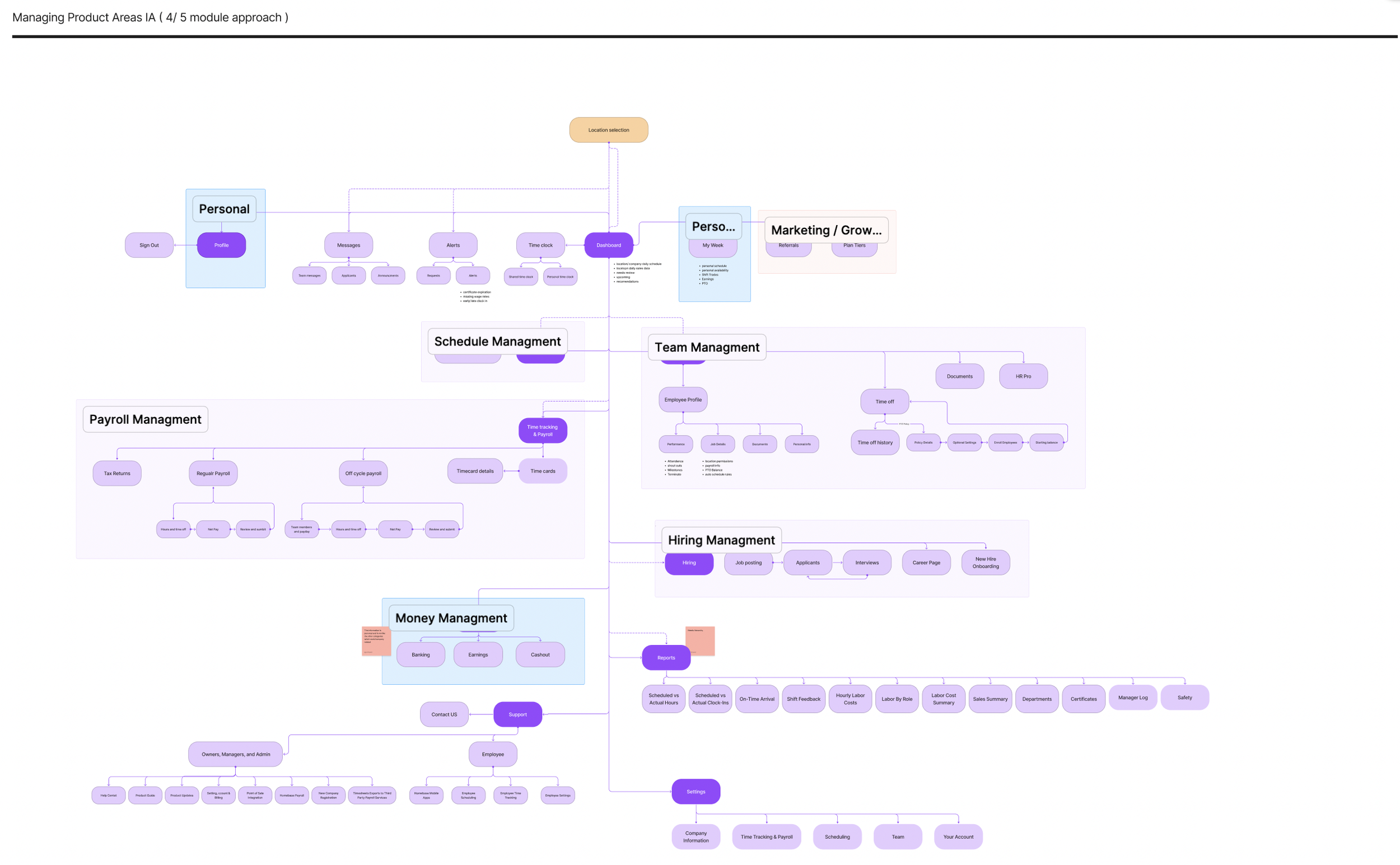
What we recommended (and why)
We converged on an IA that did four things consistently:
Reduced reliance on location exceptions
We didn’t try to erase location overnight, but we stopped letting it behave like a global filter in some places and not others.Made role mode obvious
Users shouldn’t have to infer whether they’re acting as a manager or an employee based on the menu items they see.Shortened paths to high-frequency actions
The structure prioritized “I need to do this now” tasks, not “here’s the full taxonomy of everything we offer.”Created a scalable foundation
As billing and organization moved toward company-level logic, the IA wouldn’t collapse under the weight of exceptions.
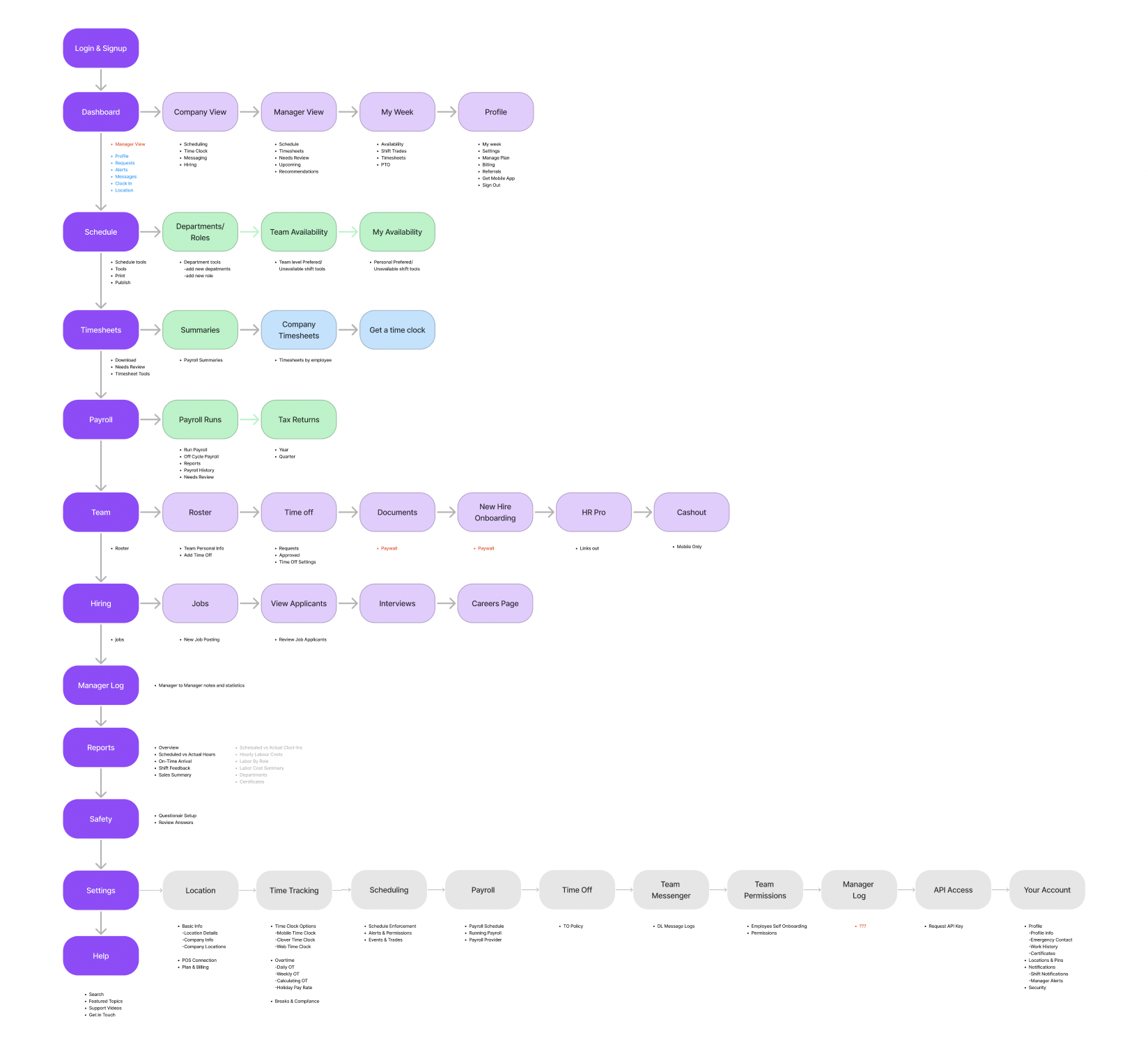
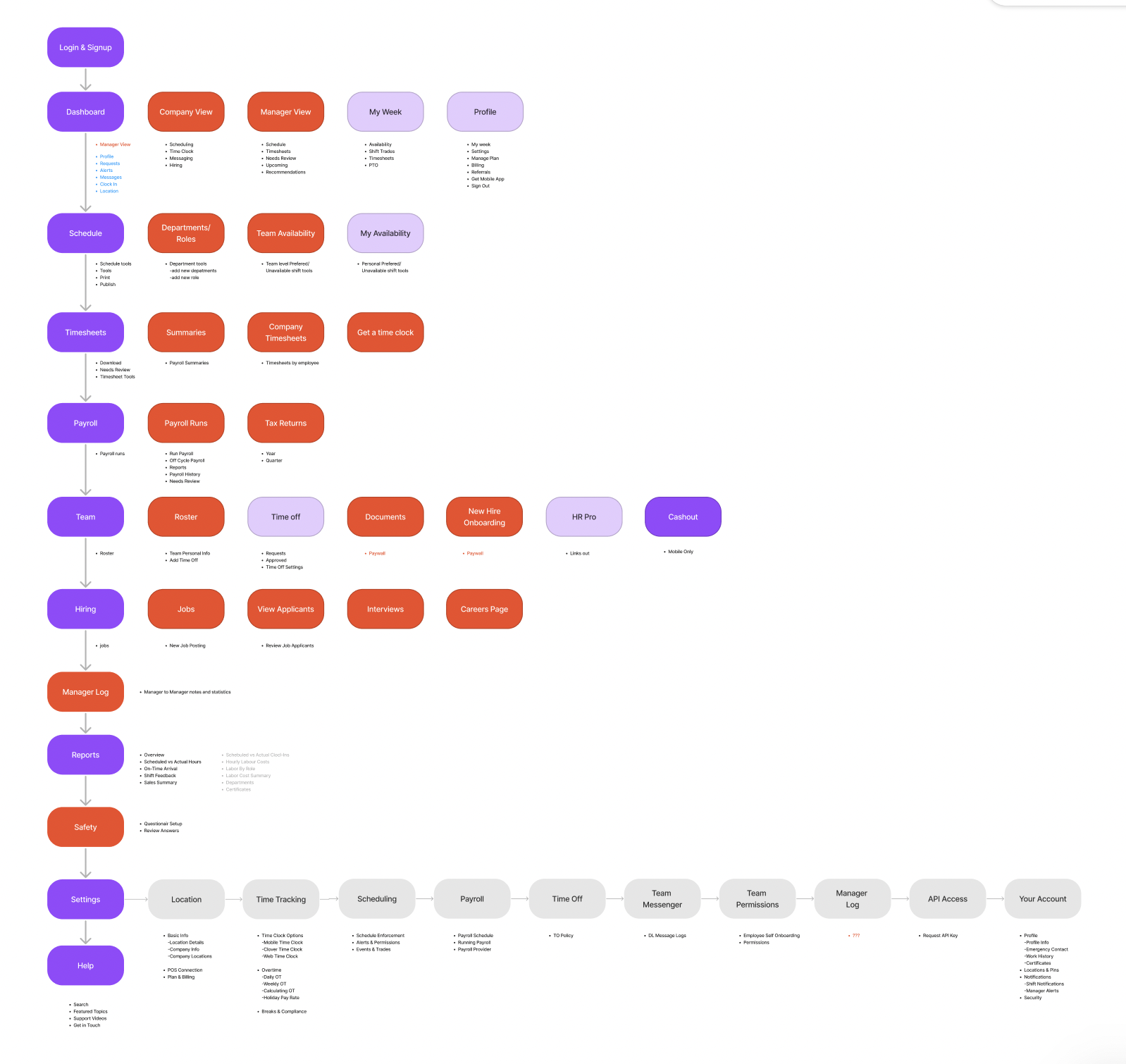
Proposed IA structure for manager facing web application
Validation: tree testing gave us confidence (and showed what to tweak)
To keep this grounded, we ran a tree test focused on high-frequency manager and employee tasks.
The results were strong enough to confirm the overall structure, and—more importantly—the misclick patterns told us exactly what needed iteration. The common issues were the ones you’d expect in an evolving product:
labels that were too internal or abstract
overlapping modules where users had to guess “which bucket is this?”
duplicate pathways that created uncertainty (“wait, are these the same thing?”)
Based on that, we:
renamed ambiguous labels
consolidated duplicates
moved a few items to reduce “either/or” category decisions
What would’ve happened next (if we shipped)
If this had moved into delivery, the next steps were straightforward and low-risk:
First-click testing on the proposed nav and landing patterns
Role + location comprehension checks to ensure scope clarity
A phased rollout by module to minimize disruption and reduce risk
That rollout plan mattered because nav changes can feel like “the product moved,” even when it’s objectively better. Phasing reduces shock and gives the team room to learn.
Reflection
This project reinforced something I’ve seen over and over: IA problems are rarely solved by “renaming menus.” The biggest leverage came from making context explicit (role + scope), reducing exceptions that break trust, and anchoring decisions in the tasks users perform most often.
Even though this work didn’t ship, it created a clear, test-backed direction and a shared structure the team can reuse when priorities shift back toward navigation and platform clarity.