Employee Availability Management
Redesigning how hourly workers set, manage, and understand their availability inside an enterprise scheduling platform used by millions.
The Challenge
Availability management is one of those things that sounds simple until you watch someone actually do it.
An employee needs to tell their employer when they can work. That's the whole requirement. But inside an enterprise scheduling platform serving retail, hospitality, healthcare, and logistics — where eligibility rules, multi-location assignments, overtime caps, and approval chains all intersect — "tell us when you're available" turns into a surprisingly painful experience.
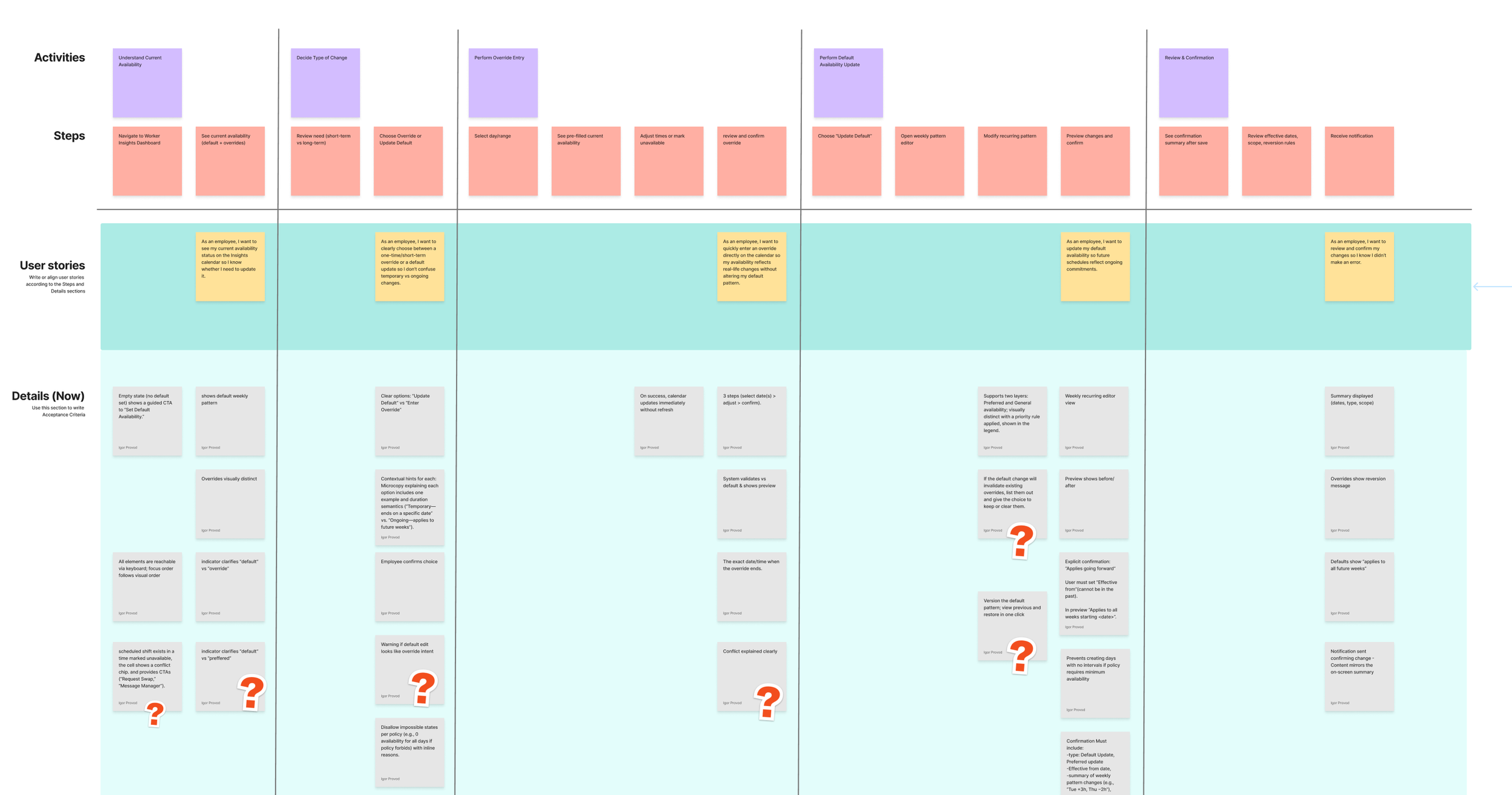
Auditing the current UX and noting the assumptions that were made, and how they are reflected in the experience
I knew this going in. What I didn't fully appreciate until I sat down with actual users was just how broken the experience felt from their side.
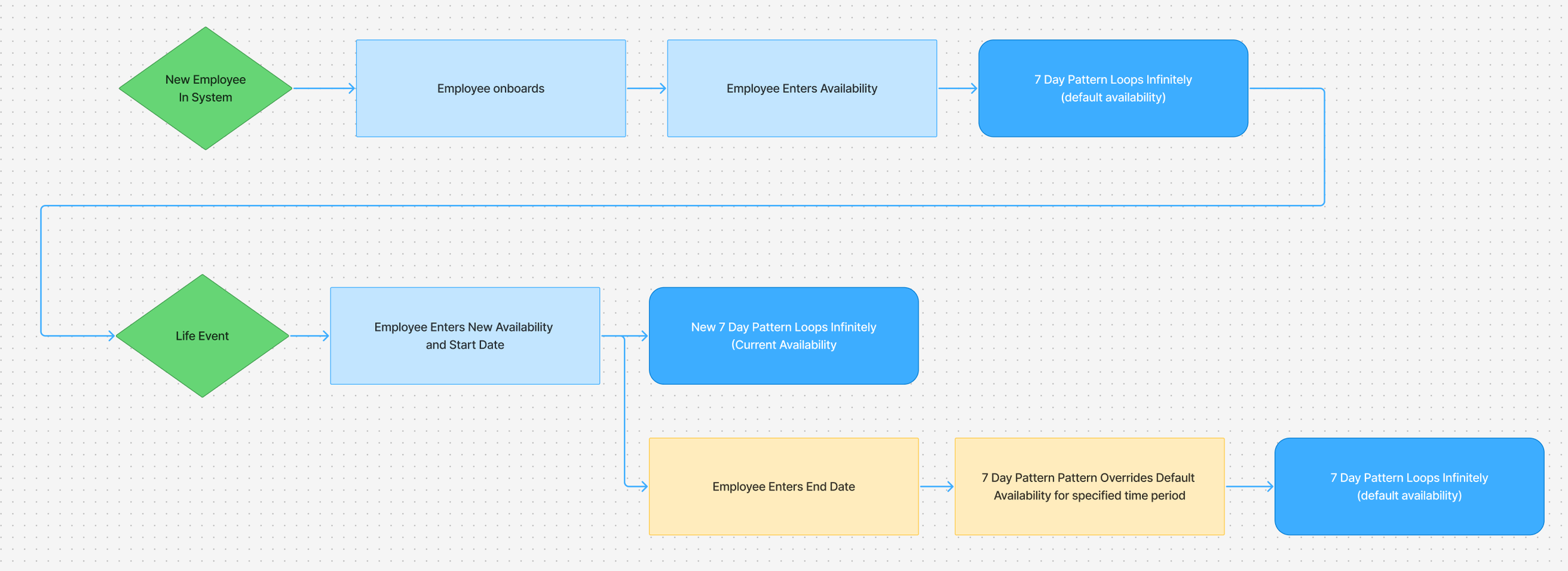
A diagram showing the current availability user flow to highlight the inflexible user experience
User Research
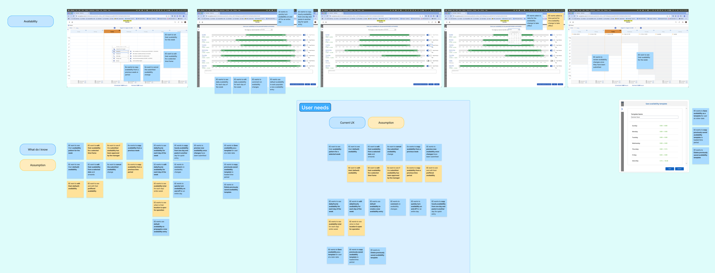
To get a better grasp of the problem, I ran interviews with a small test batch of employees across different scheduling environments. The conversations surfaced a set of pain points that were consistent enough to build around.
People were managing their availability across multiple disconnected systems. One participant tracked availability in Google Calendar, then texted her manager to confirm. Another toggled between Workday and Outlook. A third managed two jobs, each with its own scheduling tool, and updated both manually every week. The scheduling platform wasn't the source of truth — it was one of several places employees had to remember to update.
Updating availability was tedious and fragile. Participants described having to enter availability one day at a time, with no way to batch-edit or copy patterns across a week. One person explained that modifying a single day required resubmitting her entire availability — she couldn't just change Tuesday without touching every other day. Another described accidentally overwriting her schedule because the interface didn't make it clear what she was editing.
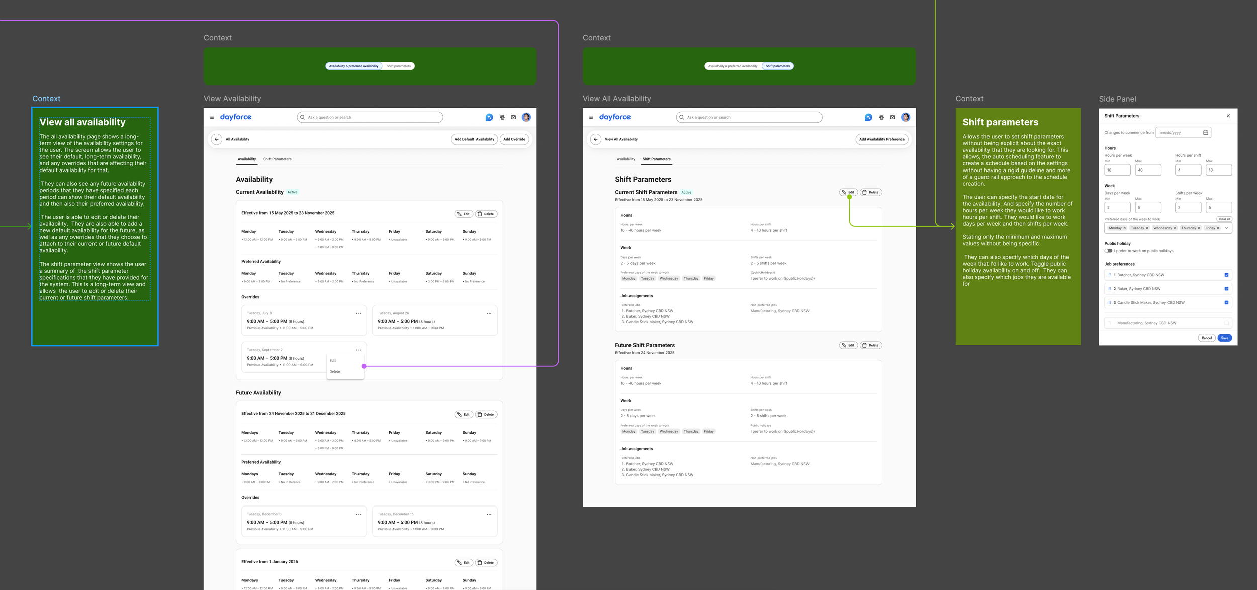
There was no visibility into what happened after submission. Employees submitted their availability and then waited. They couldn't see whether it was pending, approved, or in conflict with their manager's plan. One participant said she had no way to know if her change had even been received. Another wanted to be able to save a draft and review it before committing — something the existing system didn't support.
Temporary changes were treated like permanent ones. If an employee needed to change their availability for two weeks — say, because of a class schedule or a family obligation — they had to set it manually and then manually revert. There was no concept of a temporary override with an end date.
People wanted to express preferences, not just hard constraints. Several participants distinguished between "I can't work this time" and "I'd prefer not to work this time." The existing system didn't capture that distinction, which meant employees either over-constrained their availability or accepted shifts they didn't want.
These weren't edge cases. They were the everyday reality for people whose schedules determine their income, childcare arrangements, and ability to hold a second job.
What I Defined From There
The research gave me a clear stance: availability management needed to handle the full range of what employees actually do — not just the default weekly pattern, but one-off changes, temporary overrides, shift preferences, and the ability to see everything in context.
I presented these findings to our product team and wrote a structured product brief that defined the feature's intent: enable employees to view, edit, submit, and manage their availability in a way that's intuitive, flexible, and efficient — while keeping them informed about approval status, shift alignment, and location hours.
The brief mapped user goals across five areas: viewing and planning, editing and submitting, approval and feedback, templates and pattern reuse, and customization. It also identified seven risk categories — from approval workflow variation across clients, to time zone complexity for multi-location employees, to the performance implications of copying availability across large date ranges.
Prioritization
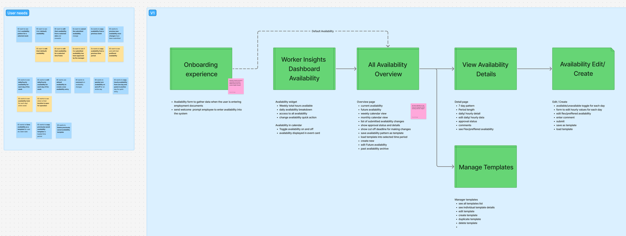
One of the most useful outputs of discovery was a clear MVP scope — a deliberate decision about what combination of functionality would make the experience genuinely useful from day one.
The line was drawn by one question: Does an employee need this to successfully submit accurate availability on their first use? If yes, it was in. If it was an efficiency gain for repeat users, defer.
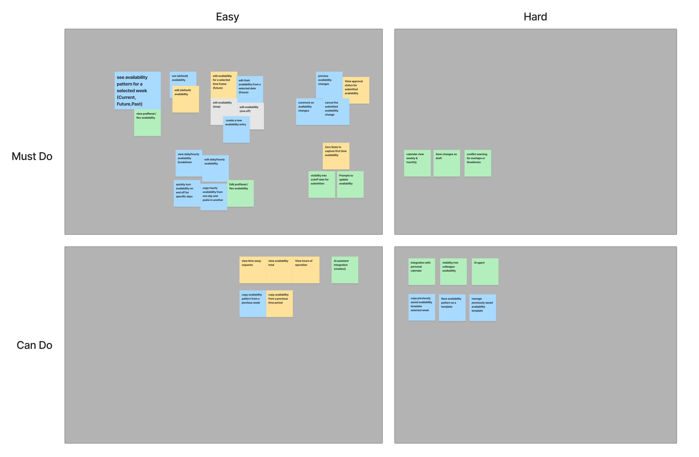
Phase 1 included: Availability in the calendar widget, editing by date range, copy from previous week, preview and submit flow, approval status visibility, cancel pending changes, system default availability as a starting point, and comments on submission.
Deferred: custom templates, preferred availability as a separate editable layer, location operating hours inline, weekly hour totals, hourly-level copy, bulk multi-week edit, and drag-and-drop.
Design
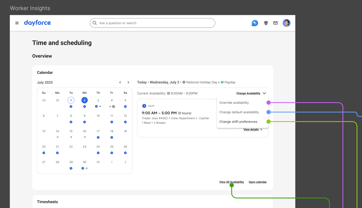
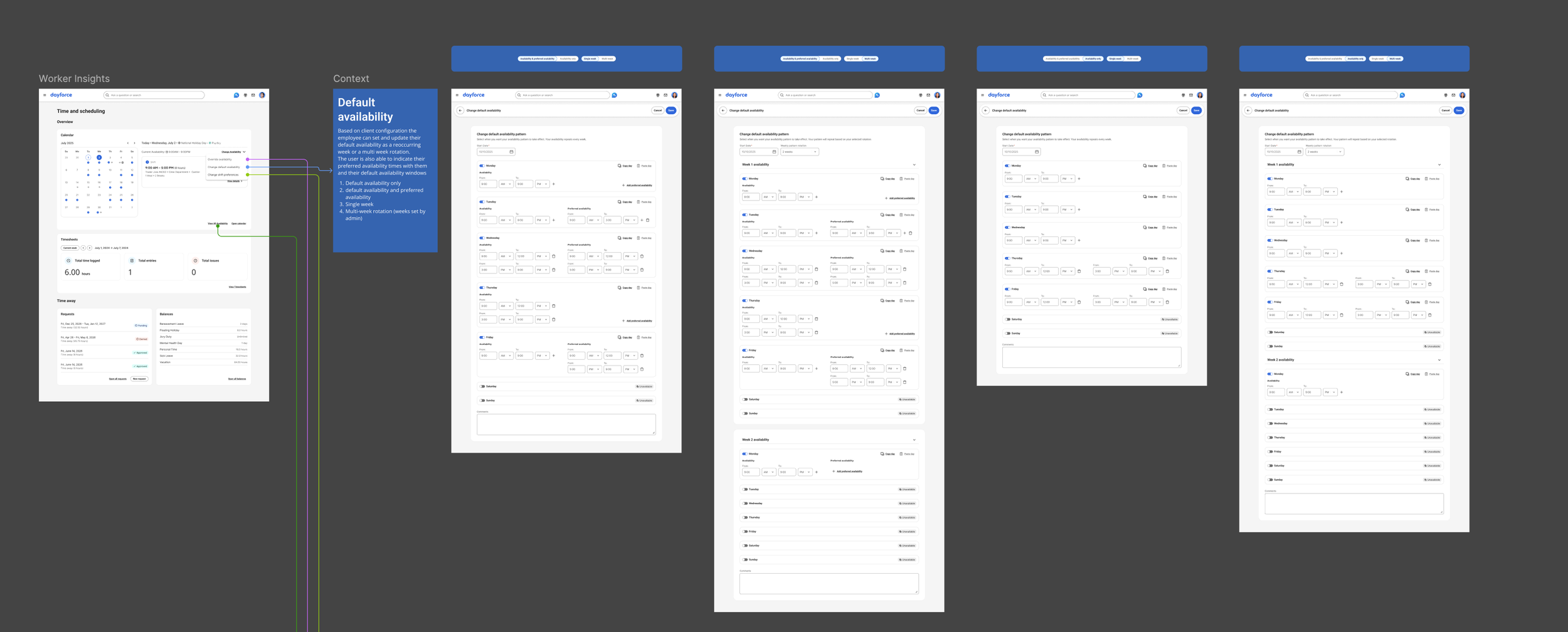
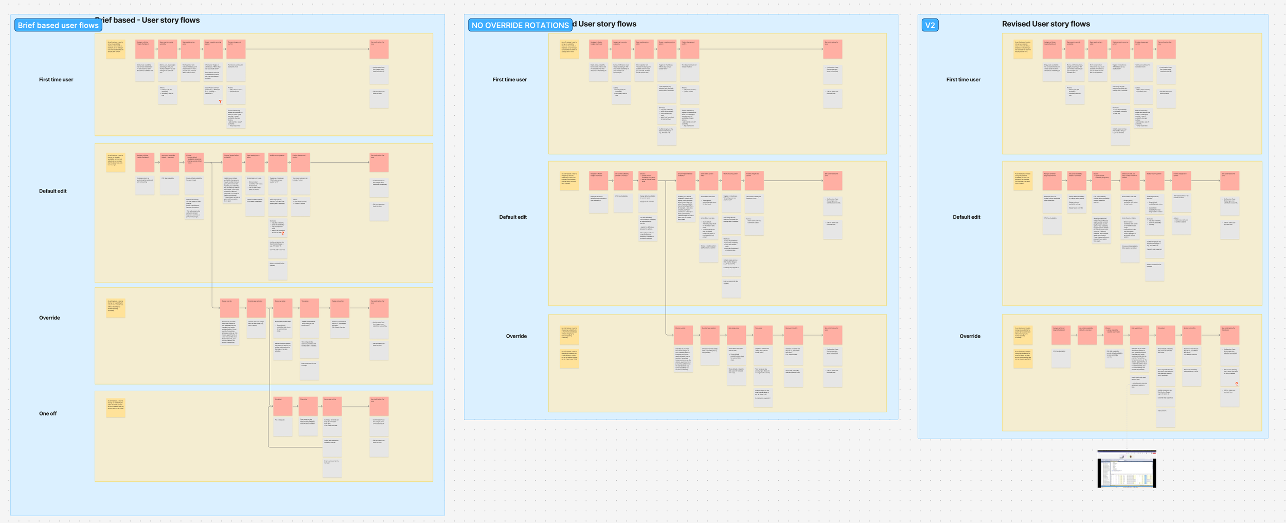
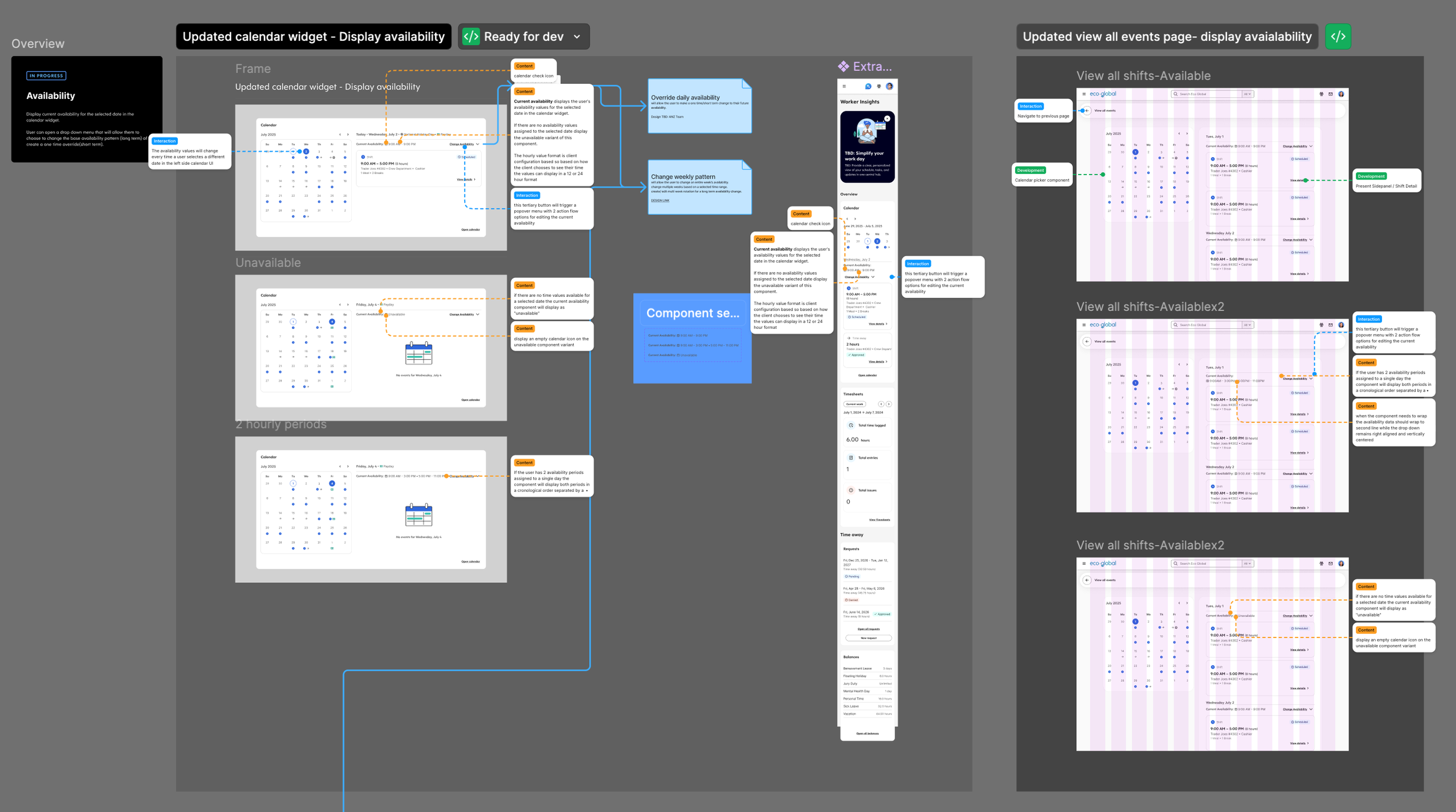
The design centers on a calendar widget— not a weekly grid, but a full calendar view showing daily availability. The calendar widget was a pre-existing design pattern in the Everest design system, and I needed to leverage it in my design exploration. The calendar which pattern was limited in the way that it would display daily information. The user needed to select a specific date to be able to see any relevant information (availability, scheduled shifts, PTO requests, stat holidays) for the selected date. Once the user was able to see their availability for the selected date, they also had an affordance that allowed them to make changes to their current and future availability.
The system supports four distinct availability flows, each designed for a different employee need:
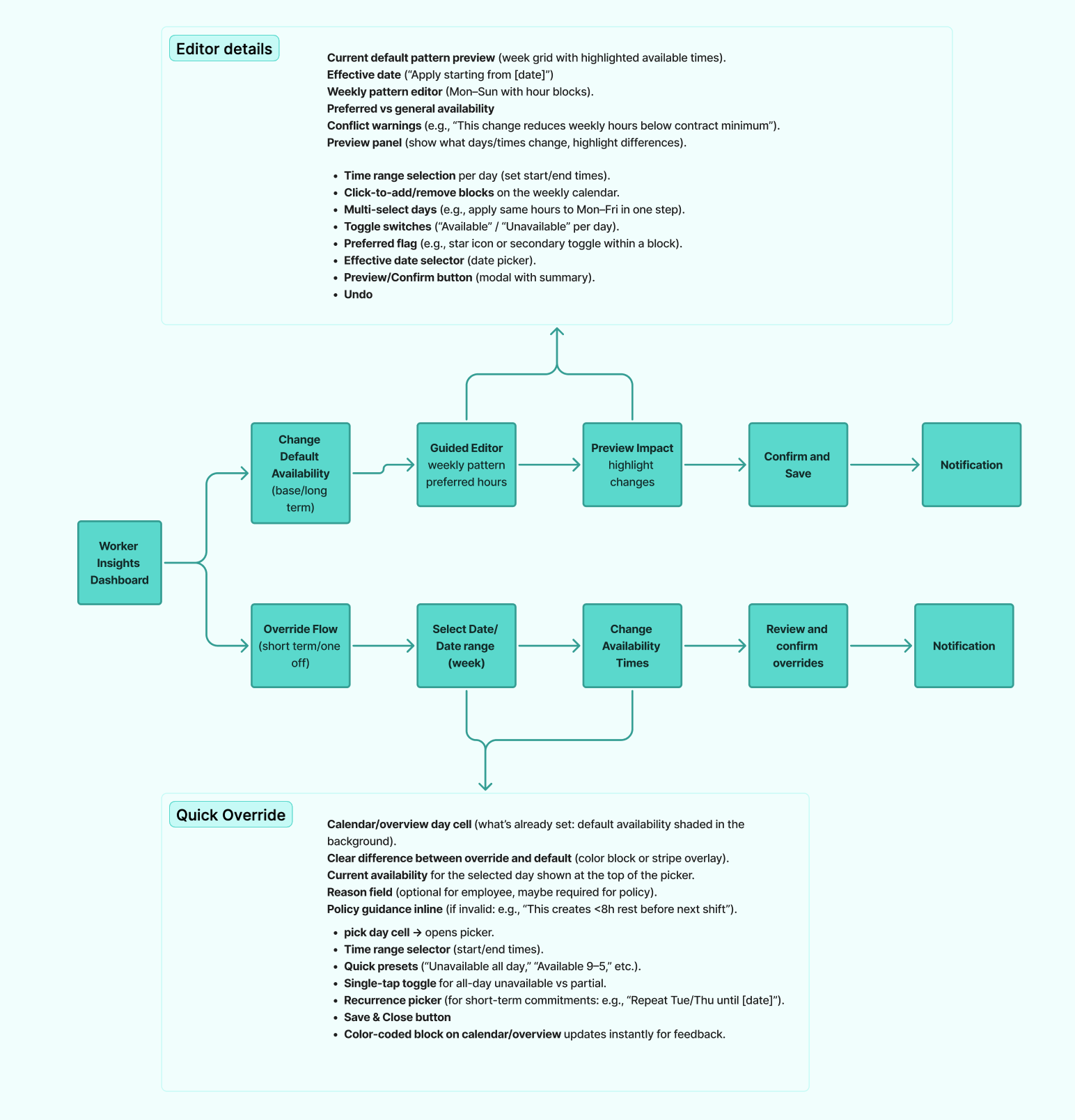
Default Availability: This is the repeating weekly pattern — the baseline that tells the system "this is when I'm generally available." Because defaults repeat week after week (or follow a multi-week rotation), the entry flow is structured around a weekly template. Employees can set their default, and the calendar reflects it across future weeks automatically.
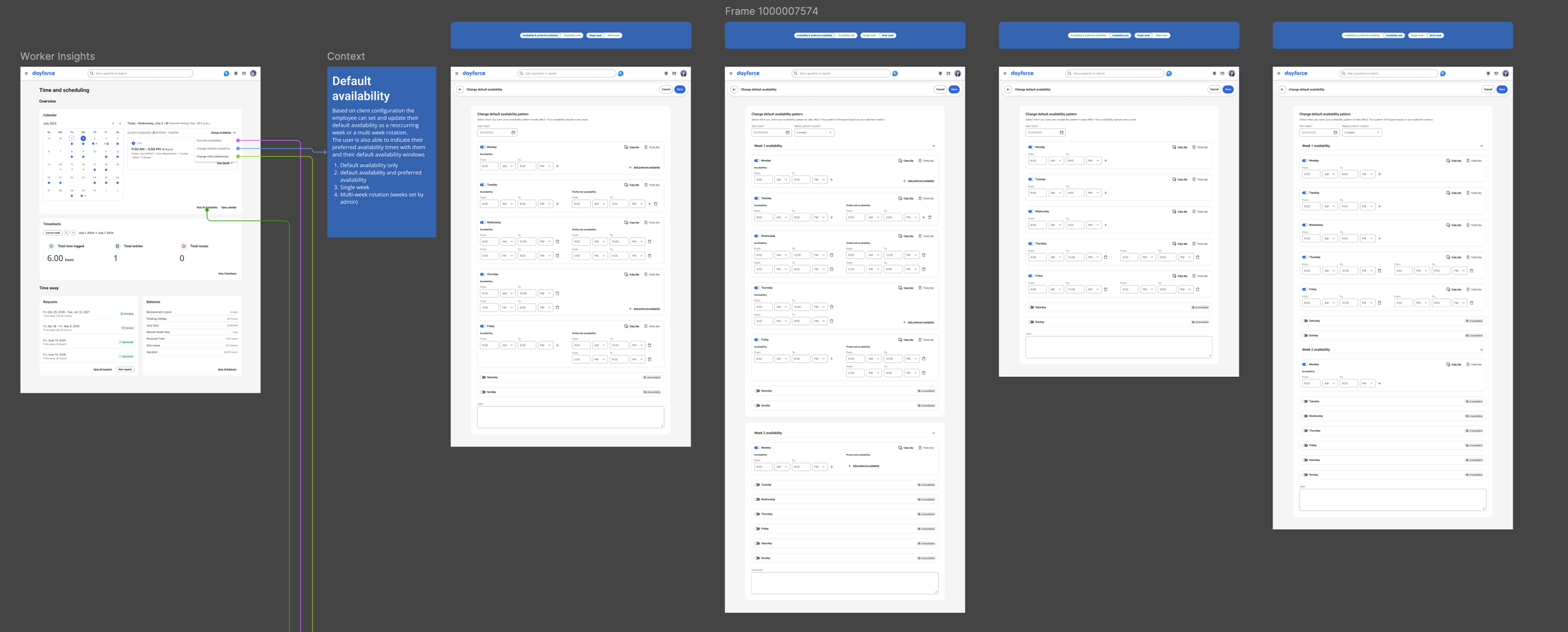
The key actions here: edit default availability, copy/paste a pattern from a previous day. These copy actions were a direct response to the research — participants consistently described re-entering the same information as one of the most frustrating parts of the process.
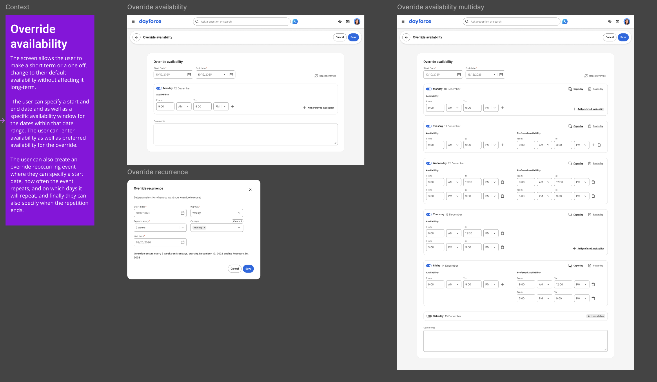
Override Availability: This is where the research finding about temporary changes became a design feature. Overrides let employees make one-off or short-term changes to their availability without touching their default pattern. An employee who needs to change their availability for two weeks because of a class schedule can do that — and the system reverts automatically when the override period ends.
The override flow includes the ability to edit availability for a specific date range, with the same copy actions available at the default level.
View All Availability: This is the comprehensive view — everything in one place. It shows current availability broken down by day of the week (Monday through Sunday, with time ranges for each), any active overrides, and any future availability changes with their effective date ranges. Each entry has edit and delete controls.
This screen directly addresses the visibility gap from research. Employees can finally see their full availability picture — what's active now, what's coming, and what's been overridden — without asking their manager or checking a separate system.
Preferred Shift Options: This flow captures the distinction participants drew between "I can't work then" and "I'd rather not work then." The preferred shift view uses the same calendar surface but with color-coded indicators that let employees express preferences alongside hard constraints. It gives managers a richer signal about employee needs without forcing employees into binary available/unavailable choices.
Shift Parameters: this flow allowed users to specify minimum and maximum values as to when they wanted to work, such as hours per week, hours per shift, days per week, and shifts per week, as well as preferred days of the week to work. The users would also be able to specify if they wanted to work on public holidays and pick which jobs they wanted to work. This feature was developed with future consideration of auto-scheduling that would allow day force scheduling agents to create automated schedules based on the selected shift parameters of the employee.
Key Design Principles
Safe editing. One of the clearest signals from research was that employees were afraid of making mistakes. Accidental overwrites, unclear edit states, and no ability to preview changes before submitting — these were real barriers to adoption. The design addresses this with a clear preview state before anything is submitted, explicit confirmation of what will change, and the ability to cancel pending changes at any point.
Flexibility over rigidity. The research showed that availability isn't a fixed weekly pattern for most people. It shifts with school schedules, second jobs, family obligations, and seasonal changes. The four-flow structure (default, override, view all, preferences) was designed to accommodate that reality without forcing employees to learn a complex system — each flow handles one type of change, and the calendar ties them together.
Transparency. Employees told us they had no idea what happened after they submitted a change. The design makes status visible at every level — pending, approved, active, overridden — so employees always know where they stand.
Accessibility first. Given the mobile-heavy user base and varying digital literacy levels surfaced in research, accessibility annotations were part of the handoff package from the start, not added retroactively. Responsive specifications documented behaviour across breakpoints.
Success Criteria
Defined upfront, before designs were started:
Employees can view, edit, and submit availability within 2–3 minutes
Employees feel confident that changes are saved, acknowledged, and aligned with their location hours
Employees can reuse availability patterns with minimal effort using copy availability
Employees clearly understand which state their availability is in — active, pending, or default
Employees have full control over pending changes before submission
Business outcomes: fewer scheduling conflicts, more timely availability submissions, and less manager time spent on clarifications.
What Shipped
The following were delivered to developer-handoff quality:
Availability calendar widget — daily view with action, flow affordance.
Default availability action flow — weekly pattern editing, copy/paste from previous day, multi-week rotation.
Override availability flow — one-off and short-term changes.
View all availability — comprehensive breakdown with current, overrides, and future availability, preferred shift options.
Shift parameters — hour limits, preferred days, holiday preferences, and job selections to support future auto-scheduling.
Accessibility annotations — full WCAG-compliant annotation set across all screens
Responsive specifications — behaviour documented across breakpoints
View Details and Scroll Behaviour documentation
Reflection
The design was complete — the brief was written, the scope was defined, the UI was finalized, and the handoff documentation was ready.
What I keep coming back to is the user research. Ten interviews aren't a massive sample, but the consistency of what people described — the fragmentation, the tedium, the lack of visibility, the fear of making a mistake — gave the design something to solve for that was specific and real. Every major design decision traces back to something a participant actually said.
The other thing I'd highlight is the scoping work. Availability management could easily become a years-long feature. Drawing the MVP line where we did — default patterns, overrides, preferences, and a comprehensive view — meant the first release would address the core pain points without waiting for every edge case to be resolved. That discipline is where a lot of the real value happens on a complex feature, even if it's invisible in a portfolio.
Another thing was the constraints of the pre-existing patterns and the designed choices that I inherited when starting to work on this project. We knew that there was a need for a full-fledged calendar UI, but we needed additional time to create a solution that would accommodate multiple use cases outside of just availability. Since this was out of scope for the MVP, I had to create some additional screens to allow user to see their availability, holistically, and not just a small window into their daily default availability.
Anchoring on the user needs to design for these additional screens exposed a strong need to provide the user with a better Calendar experience. One of the last things that I did in this project was a presentation to senior product and design leadership highlighting the user pay points around the lack of amor, robust Calendar experience that would showcase various aspects of their schedule and time management in a single view without having to rely on adjacent screens